< Back
THE ACCIDENTAL ALLY
/
GRADUATION PROJECT
Made WCAG feel like Duolingo
An exploration into why WCAG guidelines struggle to turn into practice - and how a gamified experience could change that.
TL;DR
Problem
Designers know they should care about accessibility. They just don't know where to start, and existing resources feel like reading legal documentation.
Solution
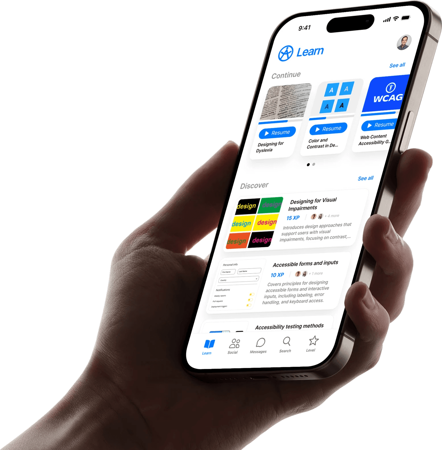
A mobile-first learning platform based on the Accessibility Champion program, with XP-based progression, role-specific content paths, and community features that make learning accessibility feel like leveling up in a game.
Impact
Validated concept through Intuit's Accessibility Champions Program. Participants reported increased motivation and daily engagement - behaviors traditional training couldn't achieve.
OVERVIEW
PROBLEM
When accessibility became impossible to ignore
In 2021, I spent six months at The Accidental Ally - a startup dedicated to making accessibility a natural part of product development. I worked alongside team members who had lived experiences with disabilities. They weren't consultants. They were co-designers shaping the process from day-one.
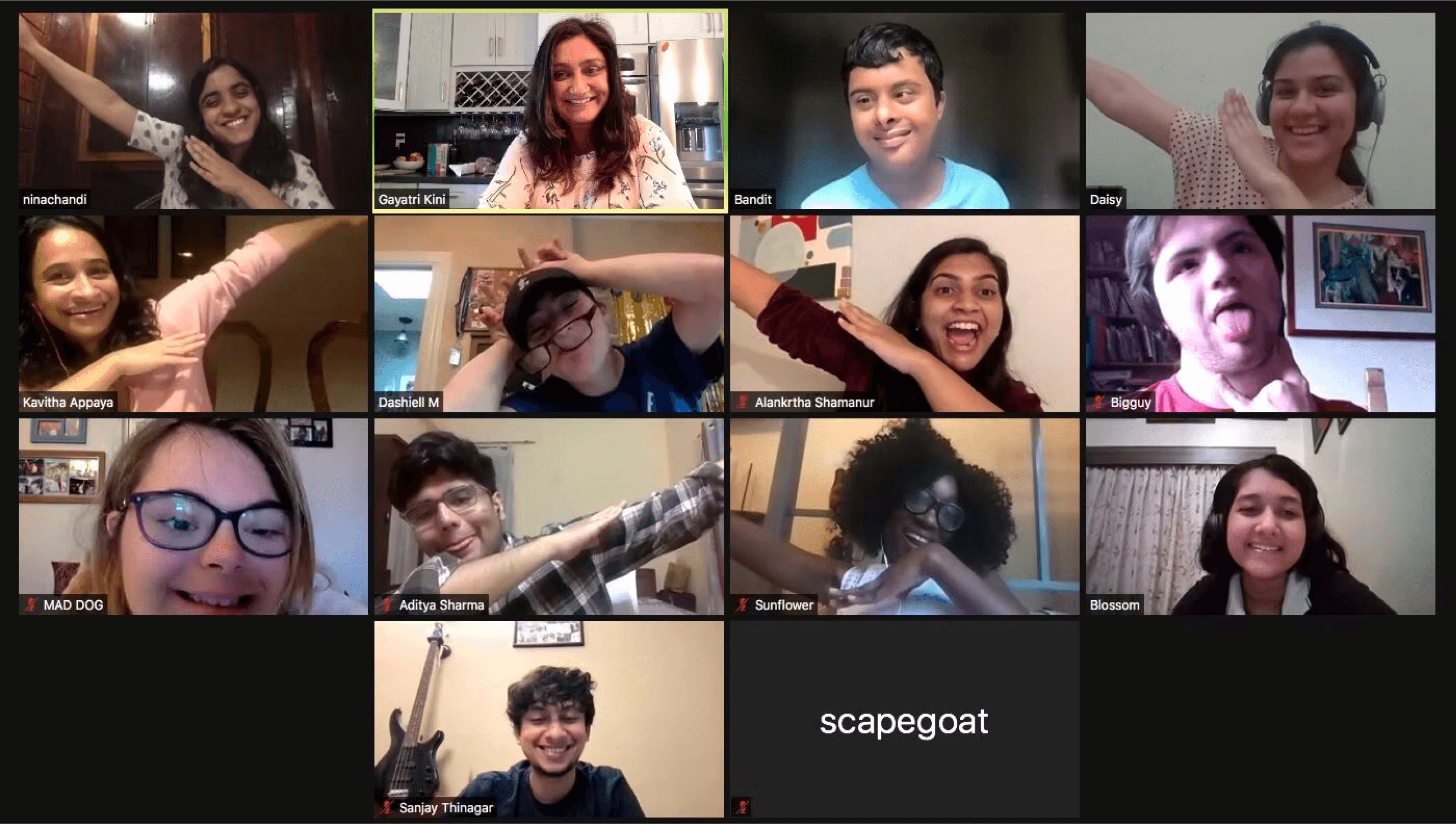
I watched them navigate products that weren't built for them. I watched people struggle with products that were considered “well designed” but quietly failed them.
Focus traps...
Unannounced errors...
Components that assumed everyone interacted the same way...
I saw how small design decisions - things I'd never considered - created massive barriers.
That experience shaped the direction I spent six months exploring:
This wasn’t about standards.
It was about access.
Role
Founding Product Designer
Timeline
~6 months | Apr - Aug 2021
Team
Sanjay (me), Karmishtha Krishna, Sneha Arvind, Gayatri Kini (Founder), The Dream Team
Skills
User research & synthesis · Design thinking · Information architecture · User flows · Gamification systems · Mobile UX · Visual & UI design · Prototyping · Usability testing · Accessibility-first design · Stakeholder feedback
RESEARCH
Why accessibility keeps arriving too late - the gap between guidelines and practice
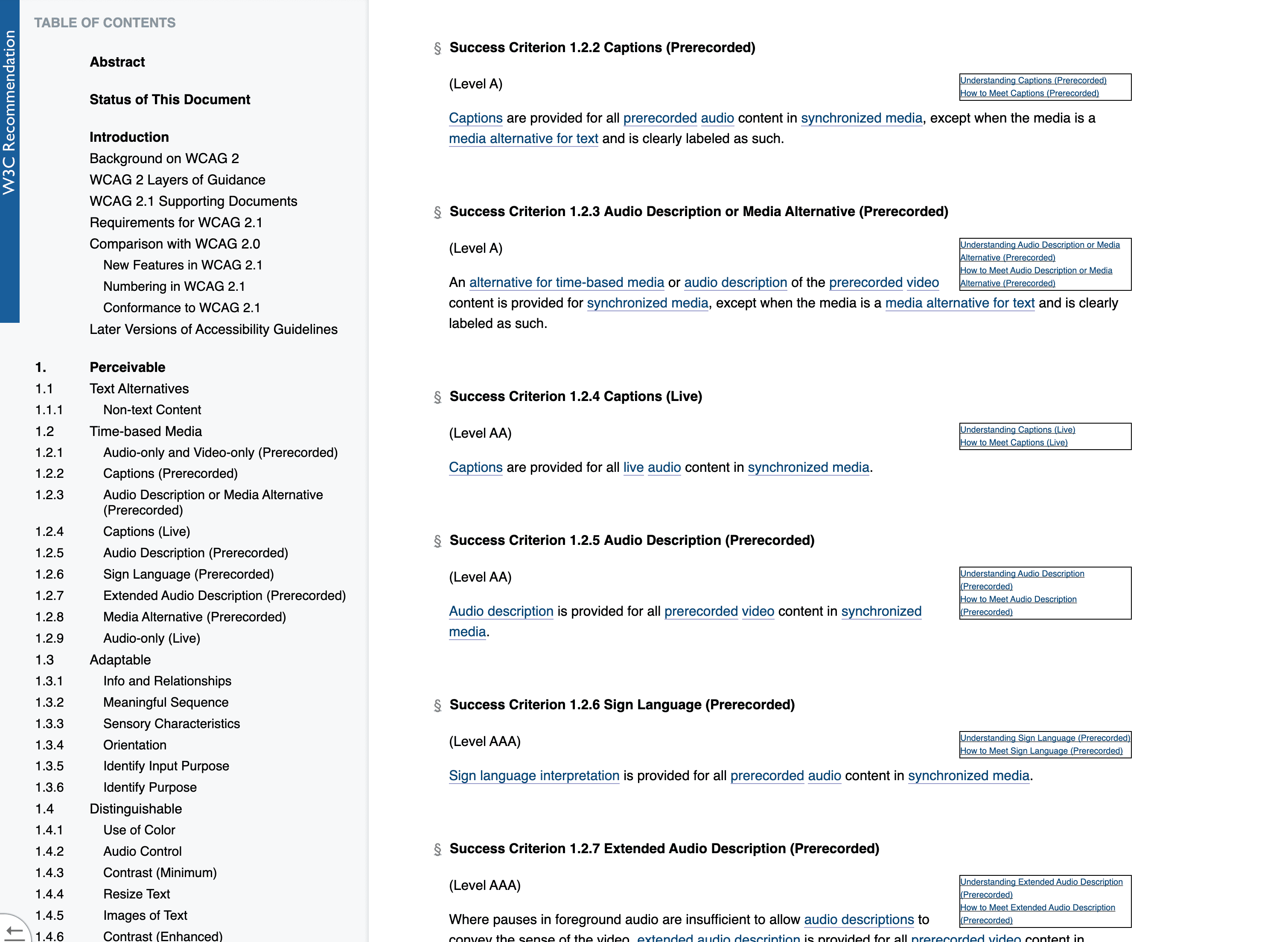
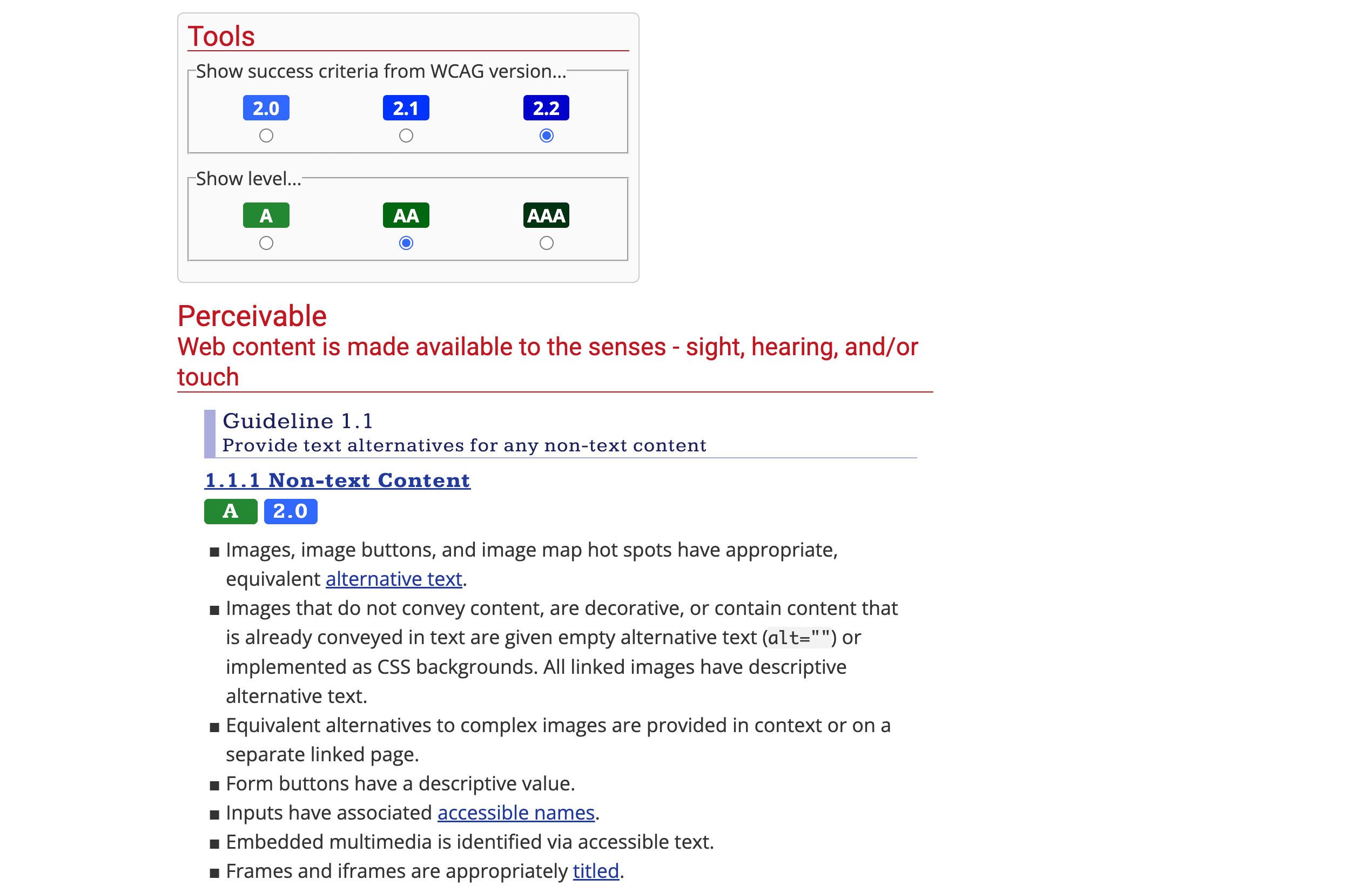
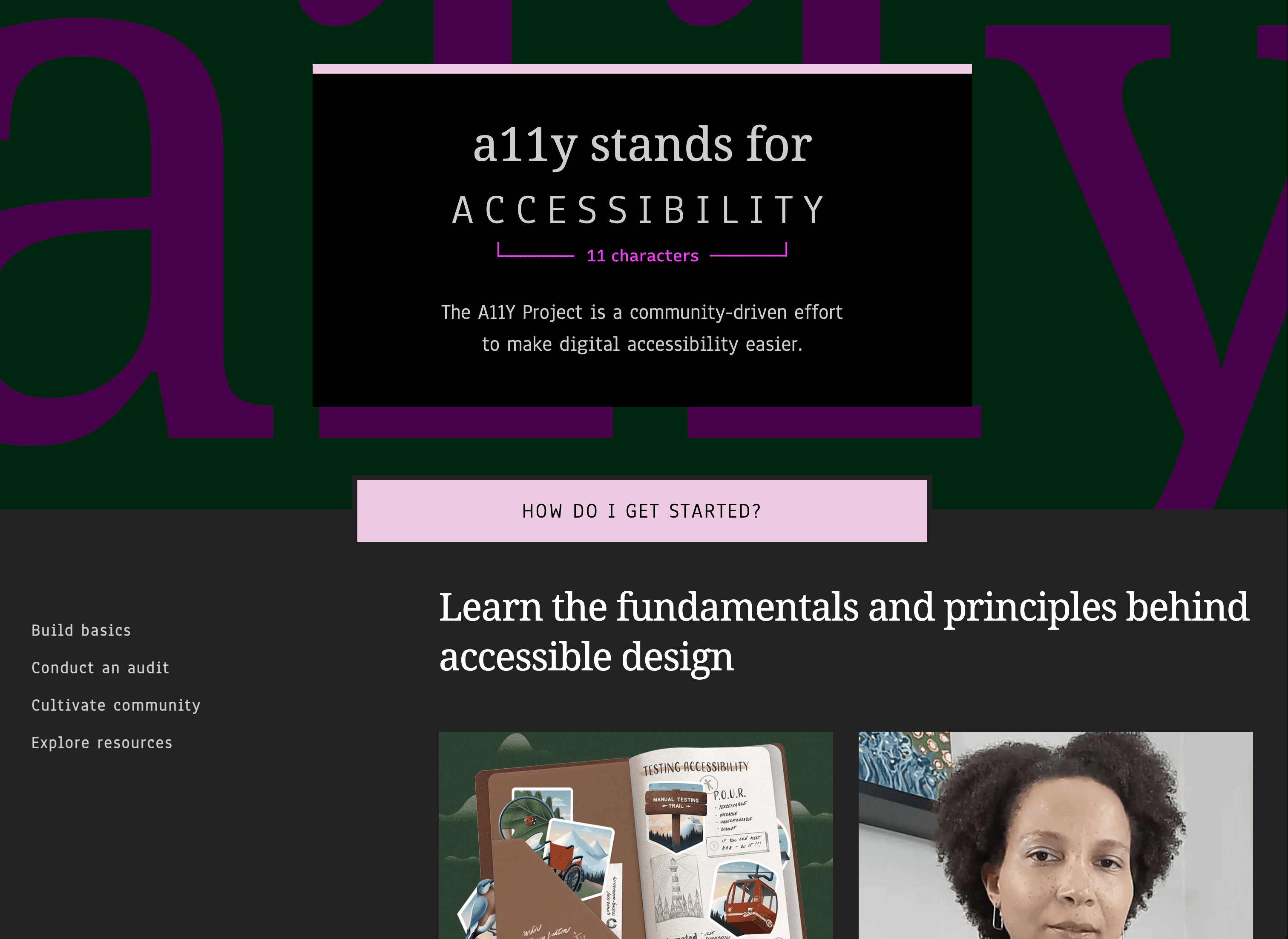
WCAG has existed for over two decades. Resources like WebAIM and The A11y Project are comprehensive and well-made. Intuit even built an Accessibility Champions Program with levels, bootcamps, and badges.
WCAG
WebAIM
The A11Y Project
-> Interview Insights
I interviewed professionals who had experience with accessibility programs at their companies, along with designers and developers at various career stages. The conversations were different in detail, but the patterns repeated almost immediately.
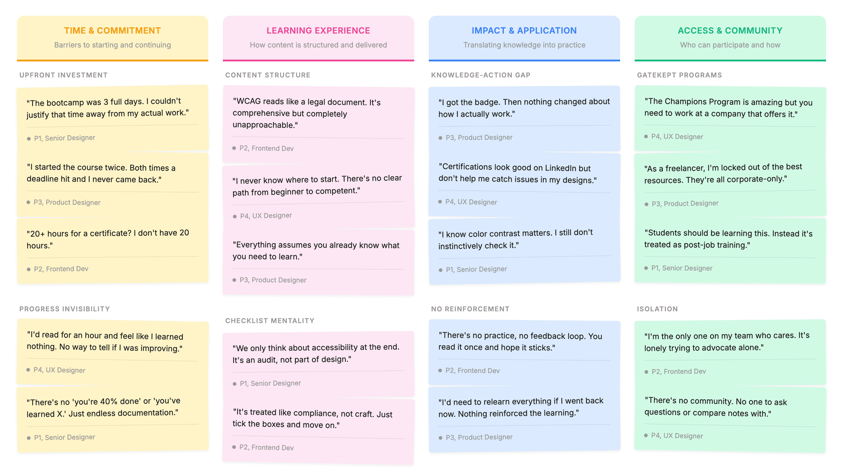
High effort, low return
Large commitments before any visible payoff. Progress felt slow and easy to abandon.
Checklist thinking
WCAG became a box to tick at the end - not part of how teams actually work.
Completion ≠ Adoption
Badges marked completion but rarely influenced real product decisions.
Gatekept access
Corporate programs excluded freelancers and students entirely.
Accessibility compliance was being treated like documentation - something to reference occasionally - rather than a system designed for sustained use.
GAMIFICATION
When learning systems actually work
I started looking at learning systems that succeed despite being difficult. Systems that make progress visible, reward effort early, and always make the next step feel achievable.
-> The owl cometh
Duolingo teaches something objectively hard - a new language - and keeps millions coming back daily. Not because it's easy, but because it’s engaging, and the experience is designed to support your effort over time.
Duolingo doesn't simplify the content...It structures it.
Progress is visible, there’s constant feedback, and small wins make long-term goals feel achievable.
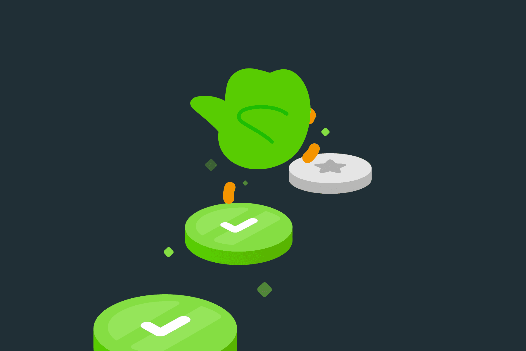
Literally seeing yourself going down a path
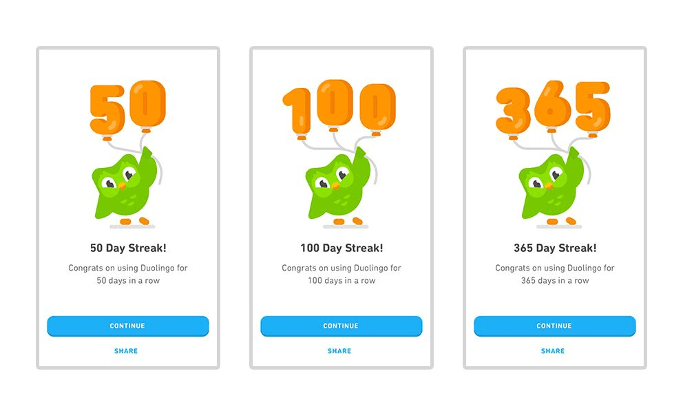
Nobody wants to break a 100-day streak
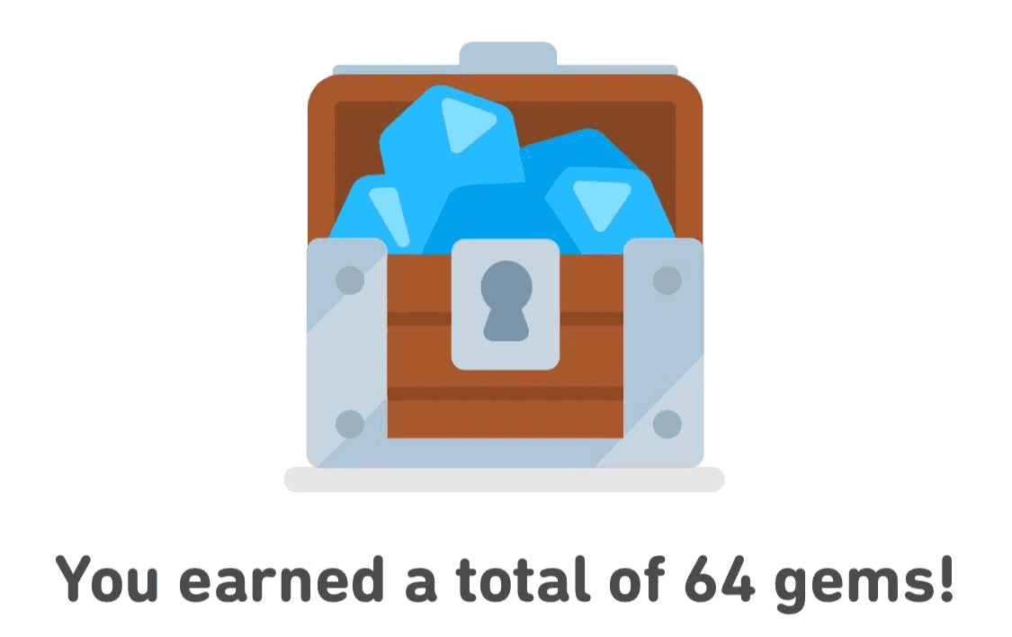
Every session ends with visible reward
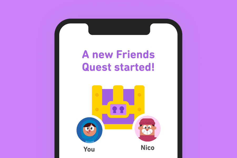
Compete with friends and strangers alike
This reframed the entire exploration.
Accessibility education didn't need clearer guidelines.
It needed a better learning experience.
What if it felt less like reading documentation and more like moving through a well-designed system? Engagement wouldn't rely on discipline alone.
It would rely on design.
-> the Theory of gamification
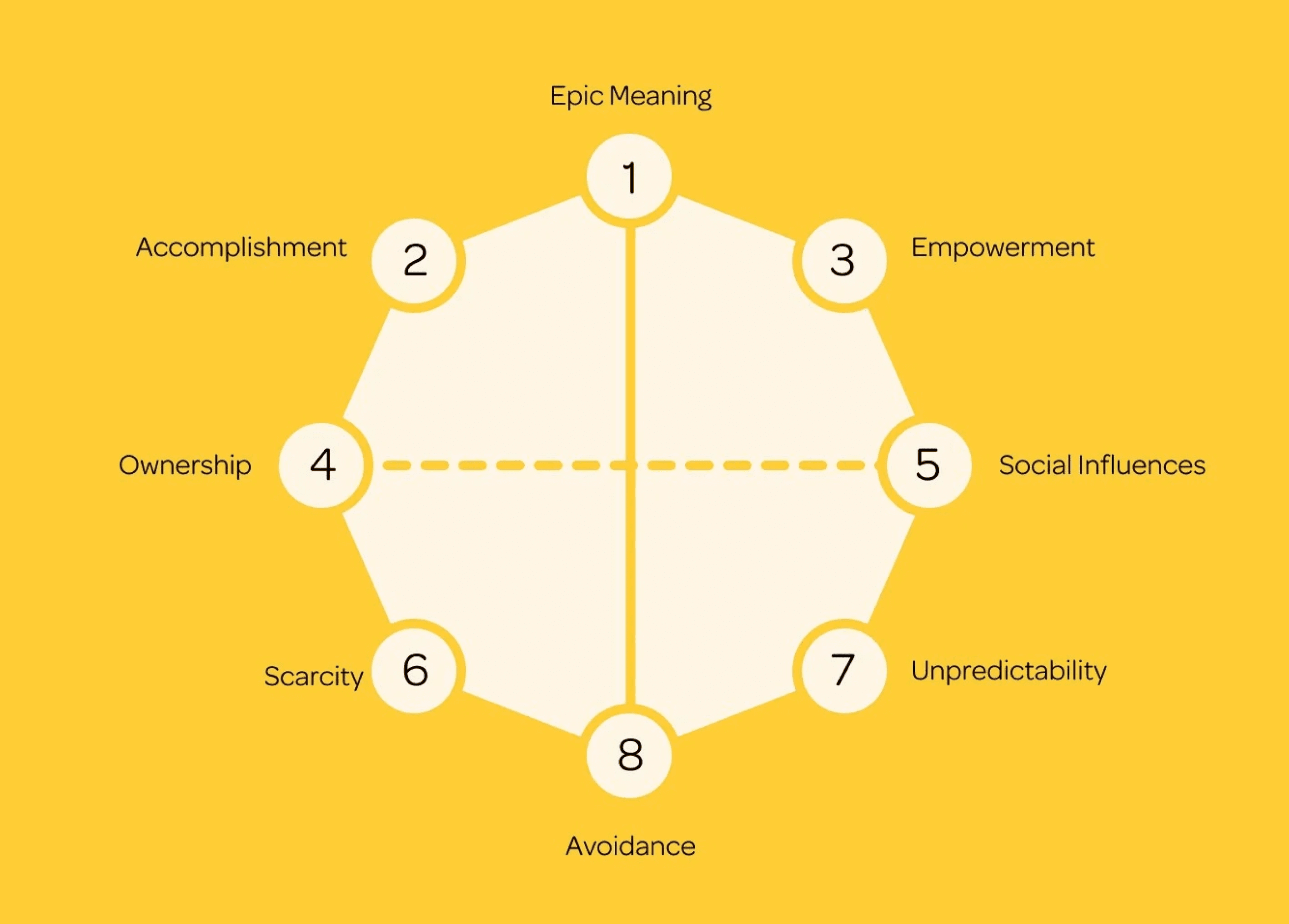
Using Yu-kai Chou's Octalysis Framework, I mapped how these gamification elements could transform accessibility education - from Epic Meaning (you're part of something bigger than yourself) to Loss avoidance (don't break the streak). The framework gave me a vocabulary for what Duolingo was doing right and what accessibility education was missing.
FRAMEWORK
Turning a framework into something people stick with
The Accessibility Champions Program already had a strong foundation - levels, progression, certification. But the core problem wasn't the framework. It was the reach. Corporate-only access meant freelancers, students, and independent designers were locked out entirely.
I explored what this framework might look like if it were designed for a much wider audience - mobile-first, self-paced, and built to feel like an engaging, gamified experience and not like a corporate training program.
-> the breakdown
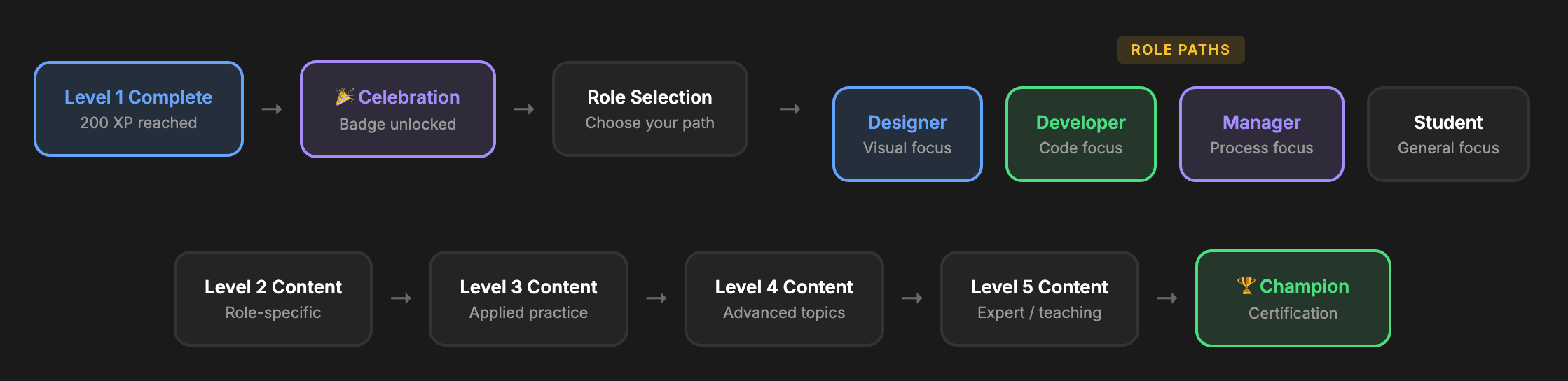
Level 01
Awareness
Universal foundation. What is accessibility? Why does it matter? No jargon. concepts anyone can understand.
Level 02
Fundamentals
Role-specific paths. Core principles applied to your discipline - design, development, or management.
Level 03
Applied
Scenario-based learning. Real case studies. Interactive challenges where you identify and fix issues.
Level 04
Advanced
Edge cases and platform-specific nuances. Complex component patterns. Mobile vs. desktop considerations.
Level 05
🏆 Champion
Teaching others. Leading reviews. Mentoring new learners. Building advocates who spread the practice.

DESIGN
Creating an Identity
-> Building the interface
Brand Identity
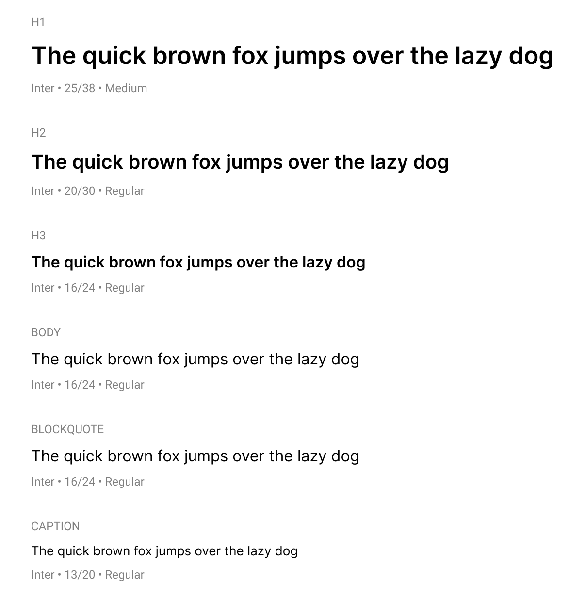
Typography
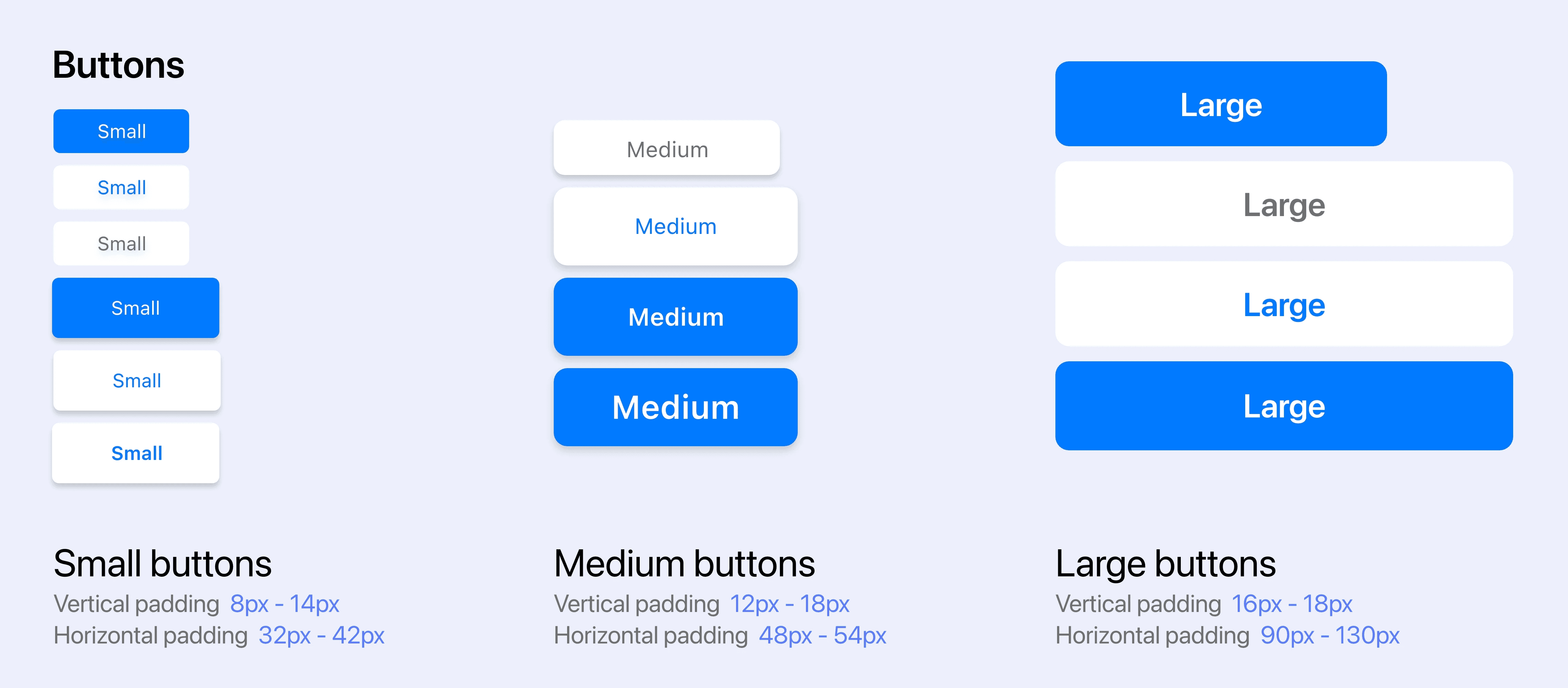
Components
SOLUTION
Able, in detail
All of this thinking - the research, the Duolingo analysis, the framework redesign, culminated in Able.
A vision for what accessibility education and implementation could look like if it were built to engage, not just inform.
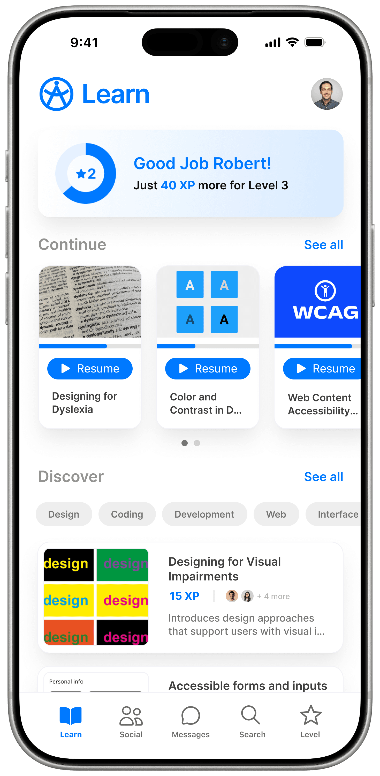
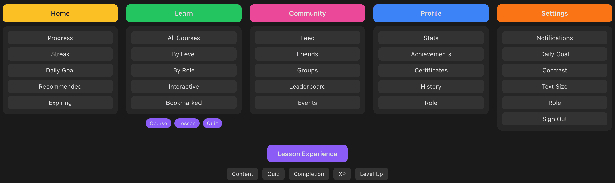
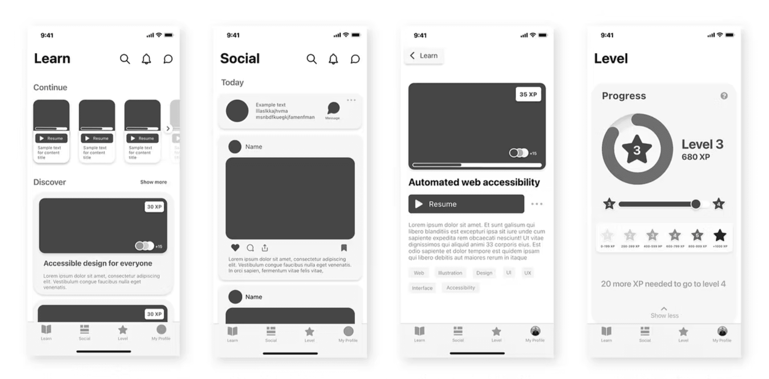
Learn ( Home ) Screen
The Home screen shows your progress, ongoing courses, and what to explore next - so you can jump back in without thinking.
Level
Track your level, XP, and achievements in one place. It gives you a clear sense of how far you’ve come and what to do next.
Badges and Achievements
Unlocking a badge marks real progress. This screen celebrates that moment and reinforces what you’ve learned.
Content
A quick overview of the course - what you’ll learn, how long it takes, and whether it’s worth your time.
Profile and Connections
A snapshot of your Connection's activity, progress, and achievements - making learning visible and shareable.
TESTING
Learning through testing and feedback
The prototype went through multiple rounds of testing and feedback. Each revealed assumptions I'd made and opportunities I'd missed.
-> evolving with feedback
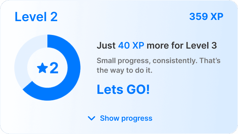
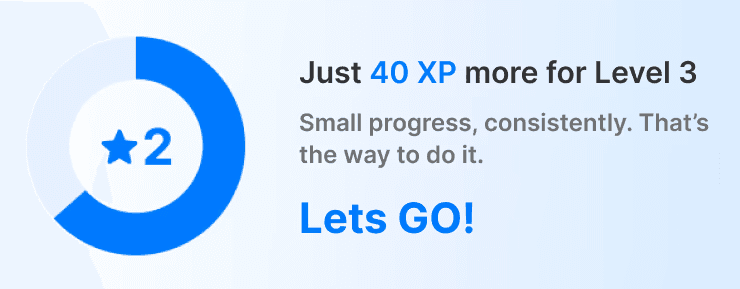
Progress ring wasn’t motivating enough
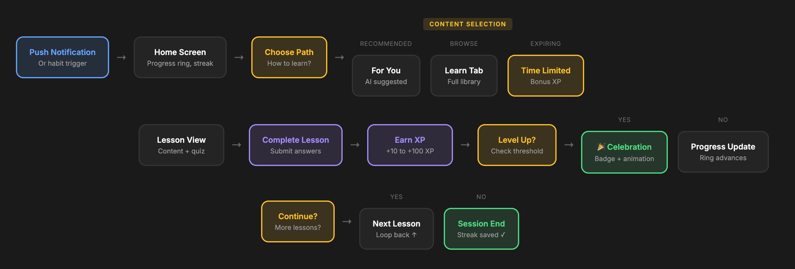
So I redesigned to show XP on every card, Users could now calculate: "30 XP per lesson, I need 45 more. Two lessons to level up."
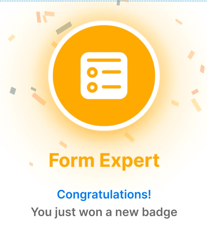
Level-ups felt anticlimactic
So I added animations, badges, share prompts. Constant feedback and rewards to make users feel motivated.
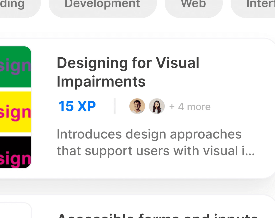
Social features felt disconnected
So I added friend avatars on lessons they're taking. Achievements and progress can be instantly shared to your friends.
-> validation and what experts said
I shared the concept with accessibility leaders to pressure-test whether this direction made sense - and to understand what would need to be true for something like this to work.
"This is fantastic. The leveling system creates clear progression without being overwhelming. If this were customizable for organizations - their own content, their own certification criteria...it could genuinely change how companies approach accessibility training."
Ted Drake - Global Accessibility Leader, Intuit
The attention to accessibility in the design process is evident and important . The social features make this feel like a community, not just a course library."
Sachin Khanna - Senior Manager, AdTech, Walmart
"Even though it's just a concept, this has huge potential in the accessibility circle. The community-based learning approach widens the user base. It's not just for accessibility experts...it's for anyone who builds digital products."
Gayatri Kini - Founder & CEO, The Accidental Ally
The concept was also tested with participants from Intuit's Accessibility Champions Program. What stood out wasn't feature feedback - it was behaviour. People talked about wanting to "level up" and checking their progress. That emotional engagement was exactly what traditional documentation couldn't achieve.
REFLECTION
Closing thoughts
This project started as a question about accessibility learning, but it ended up reshaping how I think about design more broadly.
I didn’t set out to redesign WCAG or propose a finished product. I wanted to understand why something so clearly important kept failing to show up in practice - and what would change if we treated learning itself as a design problem.
People don’t avoid accessibility because they don’t care. They avoid systems that ask too much upfront and offer too little back. When progress is visible, effort is acknowledged, and learning fits into real constraints, behaviour changes.