< Back
OVERVIEW
ESV Design System : From a loose component library to a versioned foundation → 40% fewer UI inconsistencies across four modules
Design System
B2B SaaS
Scalable UI
Accessibility
EatSafeVerified is a food safety platform used daily by lab technicians and compliance teams to process, review, and validate test results. The work is dense, repetitive, and high‑stakes. Small UI inconsistencies don’t just slow teams down - they introduce doubt.
When I joined, the product had grown quickly. Features were shipping, but the interface was fragmenting. Components were copied and tweaked in isolation. Visual decisions were made locally, not systemically. The UI worked, but it didn’t feel like a single product.
This case study is about how I designed and shipped ESV’s first design system
Role
Lead Product Designer
Timeline
~6 months | Apr - Oct 2022
Team
Designers - Sanjay Thinagar, Abhay Sharma, James Jacob, Suhasini Nadig, Prashanth Bonela, Itisha Srivatsava
3 Engineers, 1 PM
WHY?
Why build a design system?
EatSafeVerified is a B2B food safety platform used by suppliers, manufacturers, and compliance teams to track pathogen testing, manage workflows, and generate regulatory reports.
When I joined ESV, the product was growing quickly. But the interface was struggling to keep up.
ESV prioritised shipping fast. But as the product expanded into dashboards, analytics, and compliance reporting, inconsistencies quickly multiplied. Several button styles. Spacing all over the place. Seven different blues with no correlation.
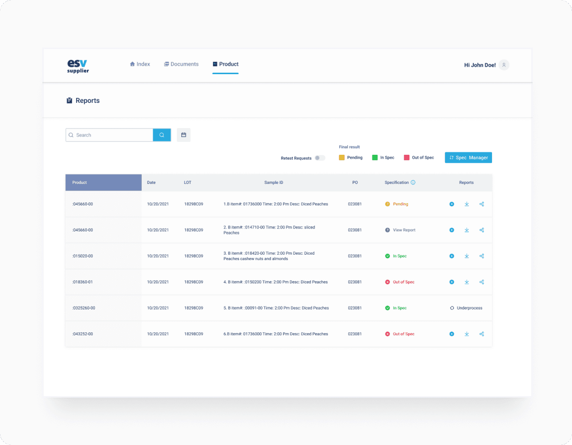
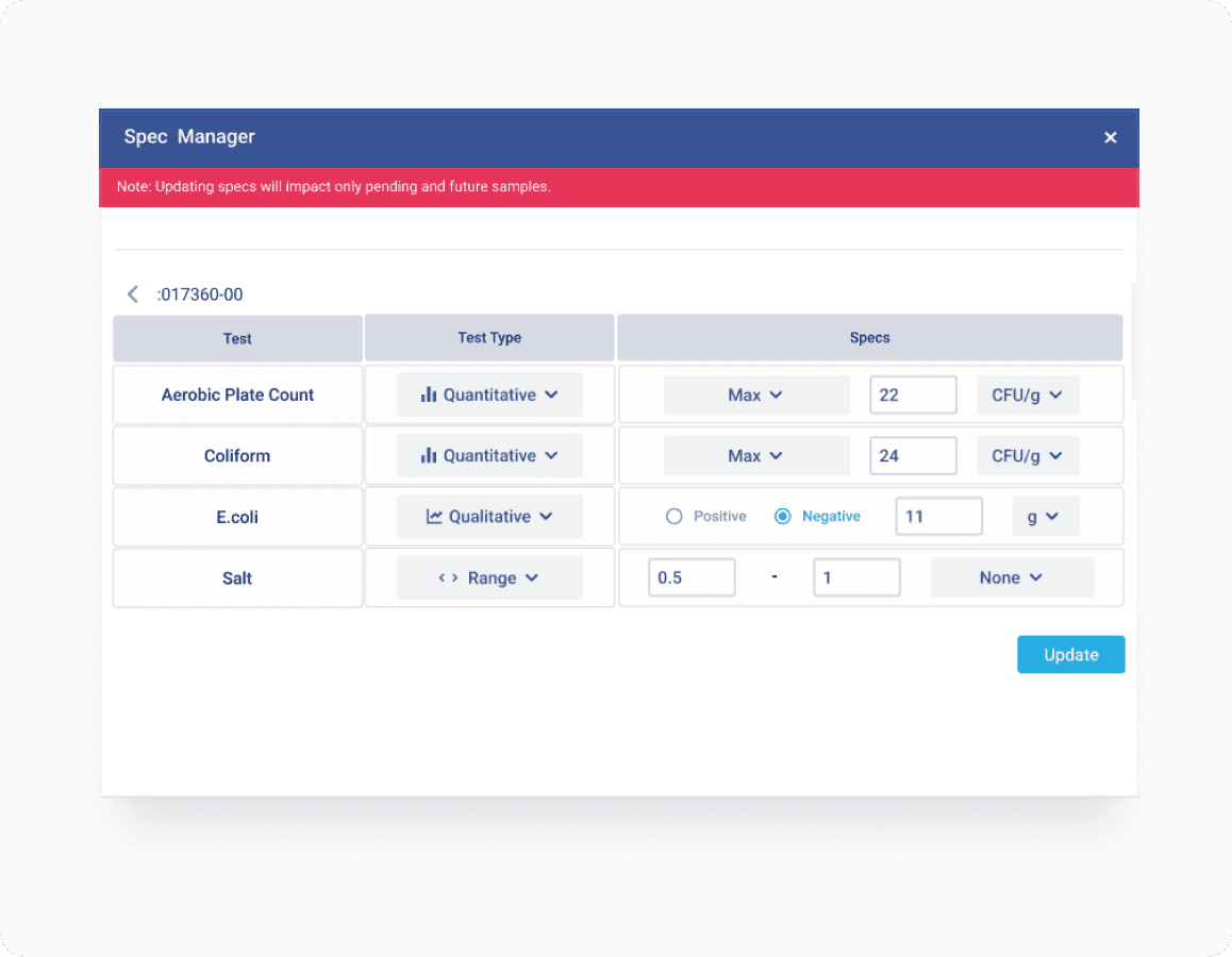
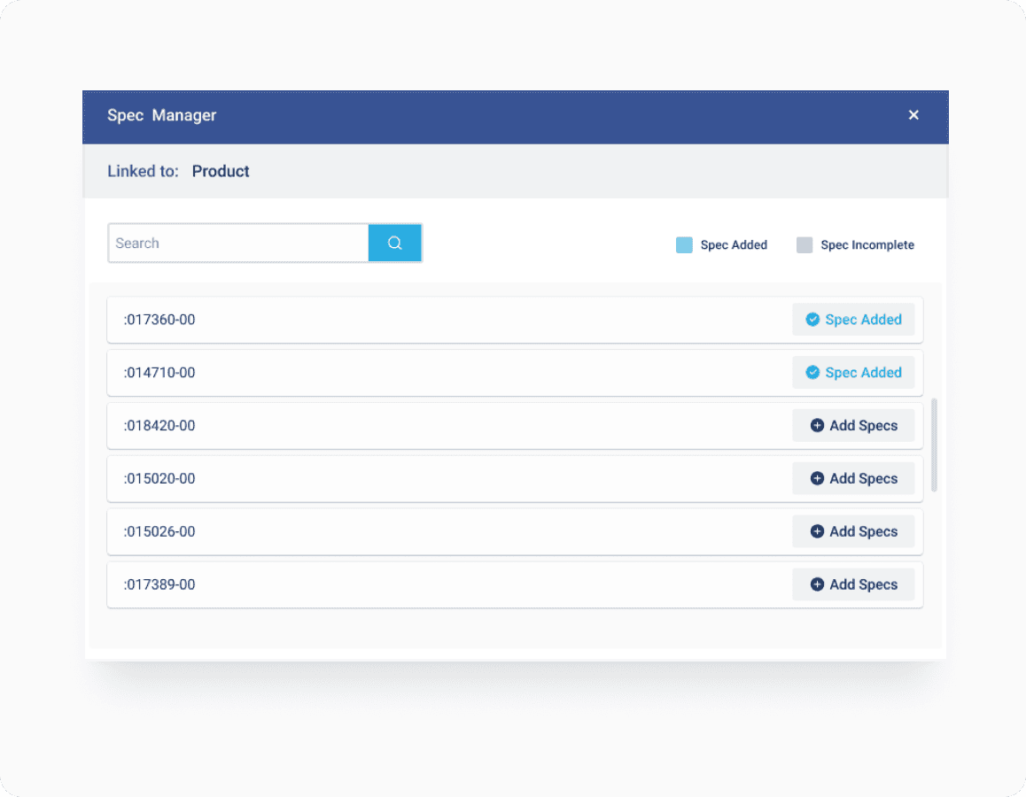
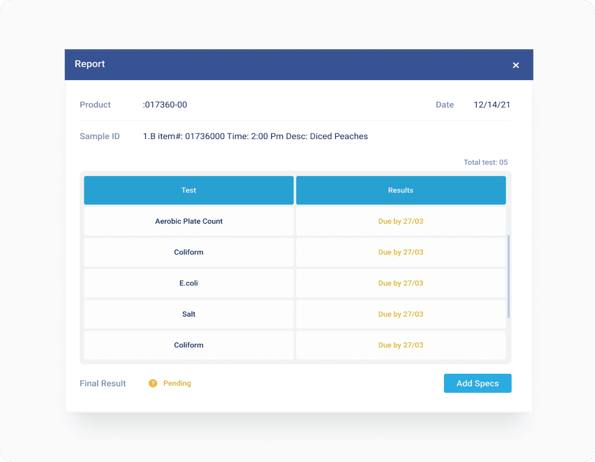
The interface worked, but it didn't feel like one consistent product. Engineers reinvented components for each feature. Design reviews had constant debates on colour and spacing inconsistencies instead of user flows . But mainly, the inconsistencies were making the product feel less trustworthy than it actually was.
Papering over the cracks was no longer sustainable. It was high time ESV needed a proper foundation.
PRINCIPLES
4 constraints to guide the process
Before building anything, our team established four principles - practical constraints based on ESV's specific context. They guided every foundation and component that followed.
Clarity above all
Clarity and confidence was key. Every element should have an obvious function, no room for ambiguity.
Flexible, but with constraints
Strict enough to maintain consistency, but flexible enough to handle edge cases without breaking.
Density with breathing room
Users scan lots of data. Must be compact enough for efficiency, but not so tight they become exhausting to read.
Accessibility
Interface had to be clear and readable at all times
FOUNDATIONS
Building up from the fundamentals
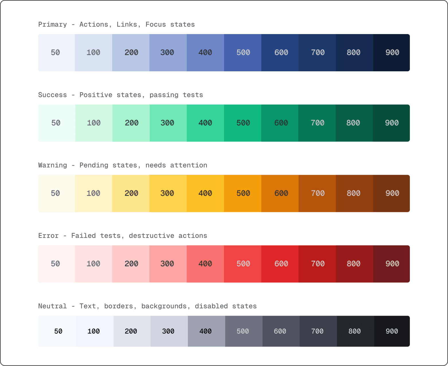
We started by establishing the fundamentals: a spacing scale, type system, and colour palette.
-> Spacing
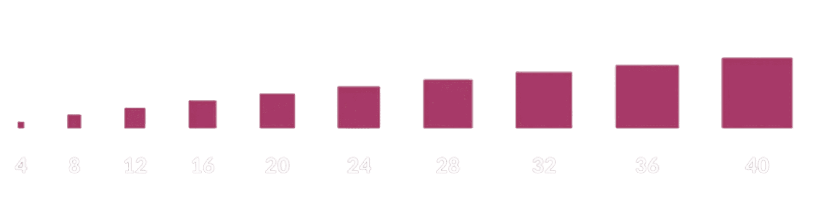
We tested different grids against real ESV layouts.
4px was flexible enough to cover dense tables as well as spaced out cards. We intentionally avoided multiple density modes early on to prevent fragmentation during adoption.
-> Typography
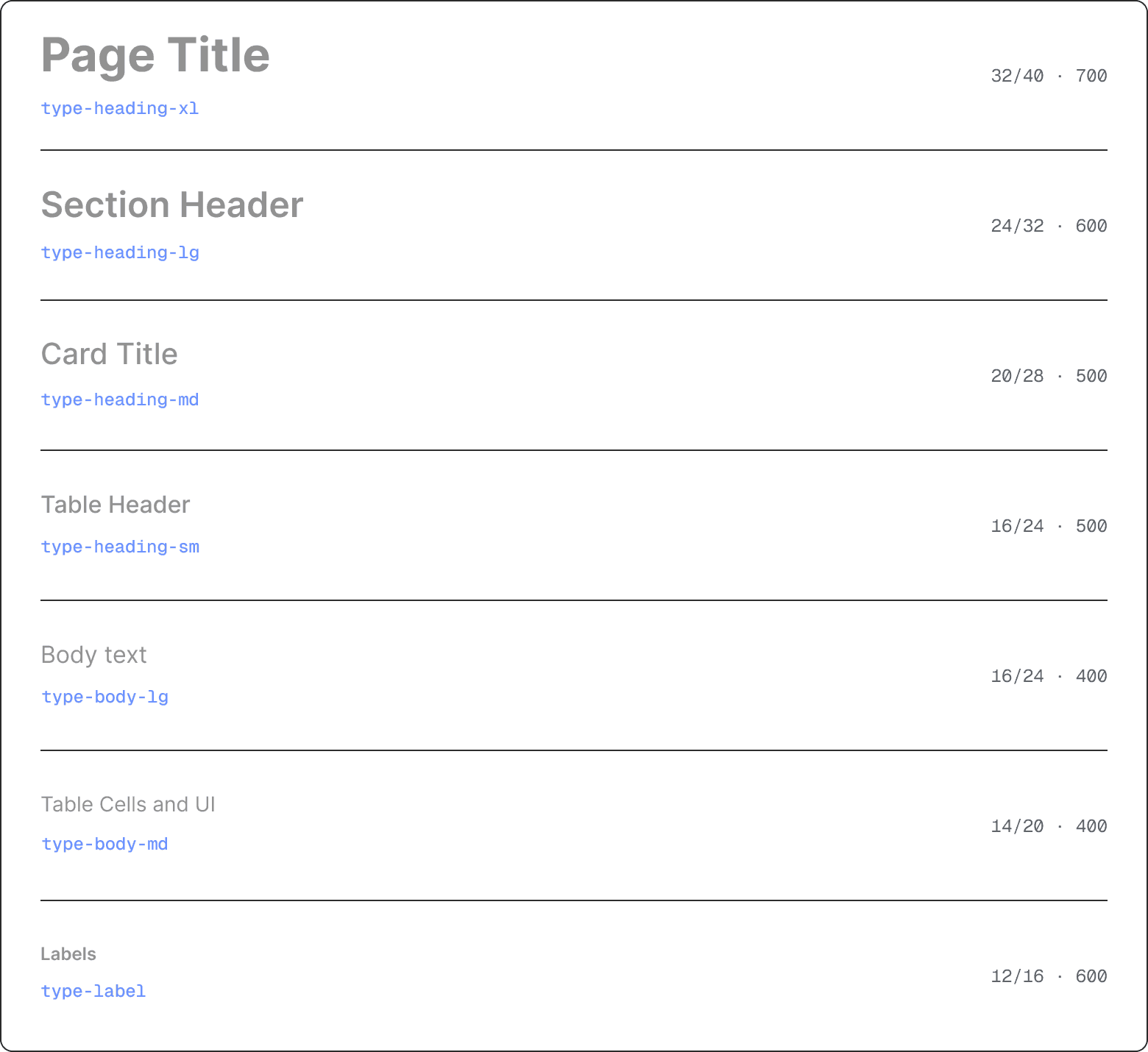
Inter. Five sizes, three weights. An important decision was 14 / 20 for table cells. Dense, with enough line height to stay readable across 30+ row tables.
-> Colour
TOKENS
Decision → System
Every value in the system has a semantic name describing its purpose. So when an engineer sees colour-primary-600, they know it's for primary interactive elements.
color-primary-600
Button backgrounds
color-error-600
Destructive actions
space-16
16px
Component padding
type-body-20
14/20
Table Cells, UI Text
radius-md
8px
Buttons, Inputs, Cards
When we updated the primary brand colour six months later, it was one token change across the entire product. No hassle.
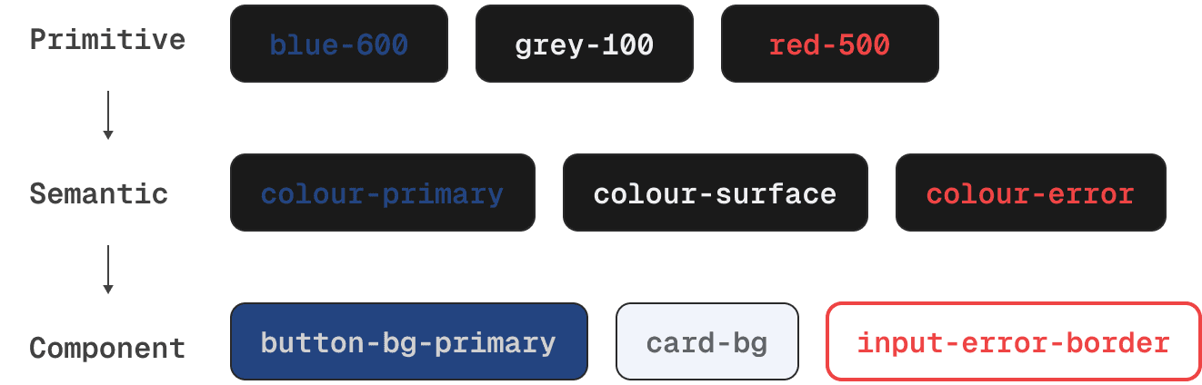
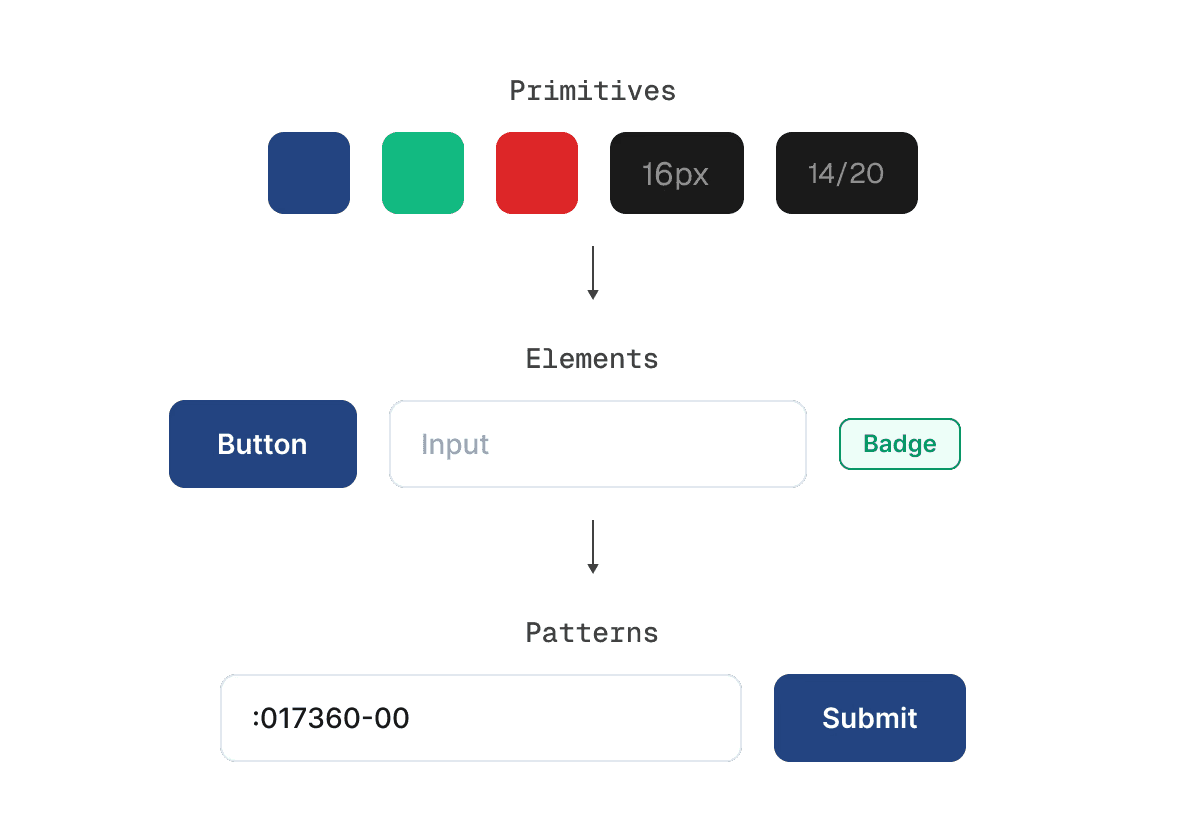
We organised the token structure into three levels: Primitive (raw values), Semantic (purpose-based), and Component (specific to UI elements). This hierarchy makes it clear when to use which token.
COMPONENTS
Building blocks
We audited 15 core screens, cataloged every UI element, and ranked them by frequency and cognitive load. The goal was to build the 20% of components that would solve 80% of the interface.
Three categories emerged as priority #1: buttons, form inputs, and tables.
Everything else comes later.
-> component Hierarchy
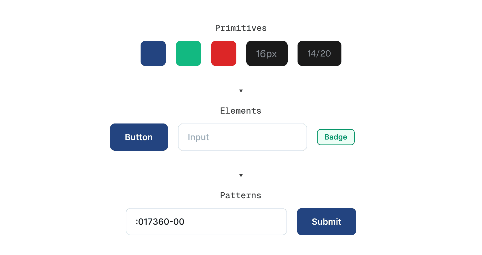
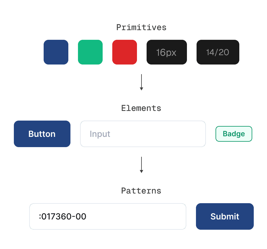
Every component references the spacing scale, type system, and colour tokens established earlier. Changing a foundation value updates components automatically.
-> Buttons
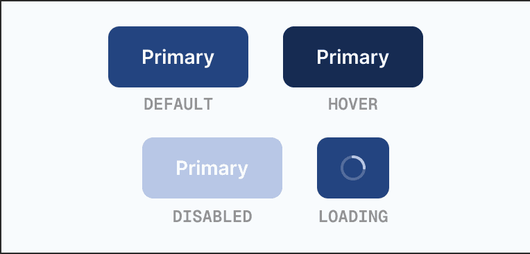
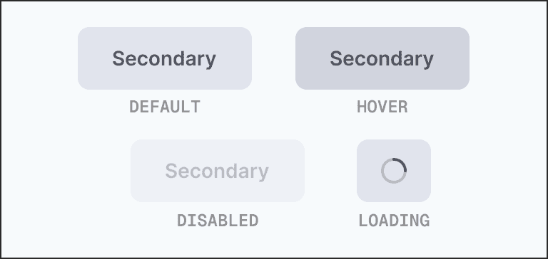
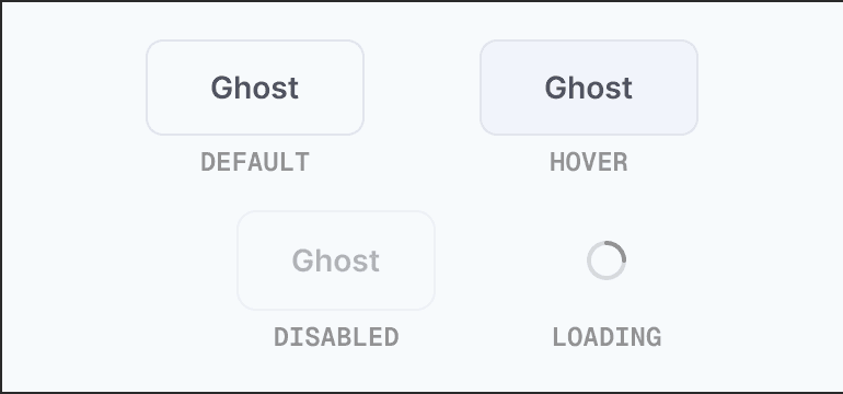
We reduced buttons to four variants with explicit hierarchy rules.
Use case
Main Action
Rule
One per view
Use case
Alternate Actions
Rule
Lower visual weight
Use case
Dismissive, Tertiary
Rule
Cancel, Close, Back
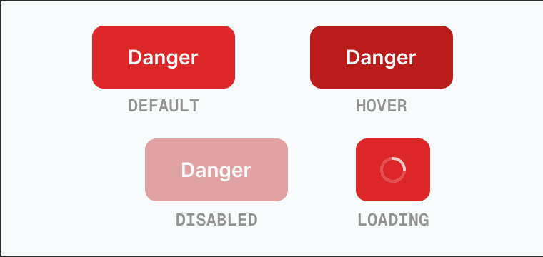
Use case
Destructive
Rule
Delete, Remove
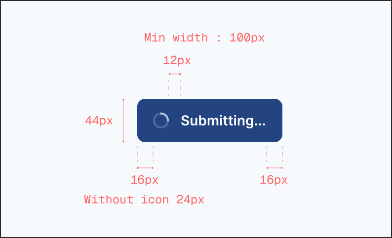
Button Anatomy
Padding
12px vertical / 24 px horixontal
Label
14 / 600
Radius
8px
Wrapper
44px x Auto
Icon Slots
16 x 16
-> Forms
Forms are an important part of ESV - entering sample IDs, selecting test types, specifying batch numbers. We treated forms as a system, not a collection of isolated inputs.
The 8px label-to-input gap creates visual association. The 20px field-to-field gap creates clear boundaries, to reduce cognitive load during long sessions.
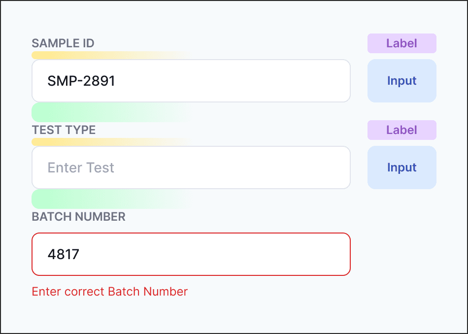
Horizontal padding
16px
Border
1px . neutral-200
Label text
12px/600 . neutral-500
Input text
14px/500 . neutral-900

-> Tables
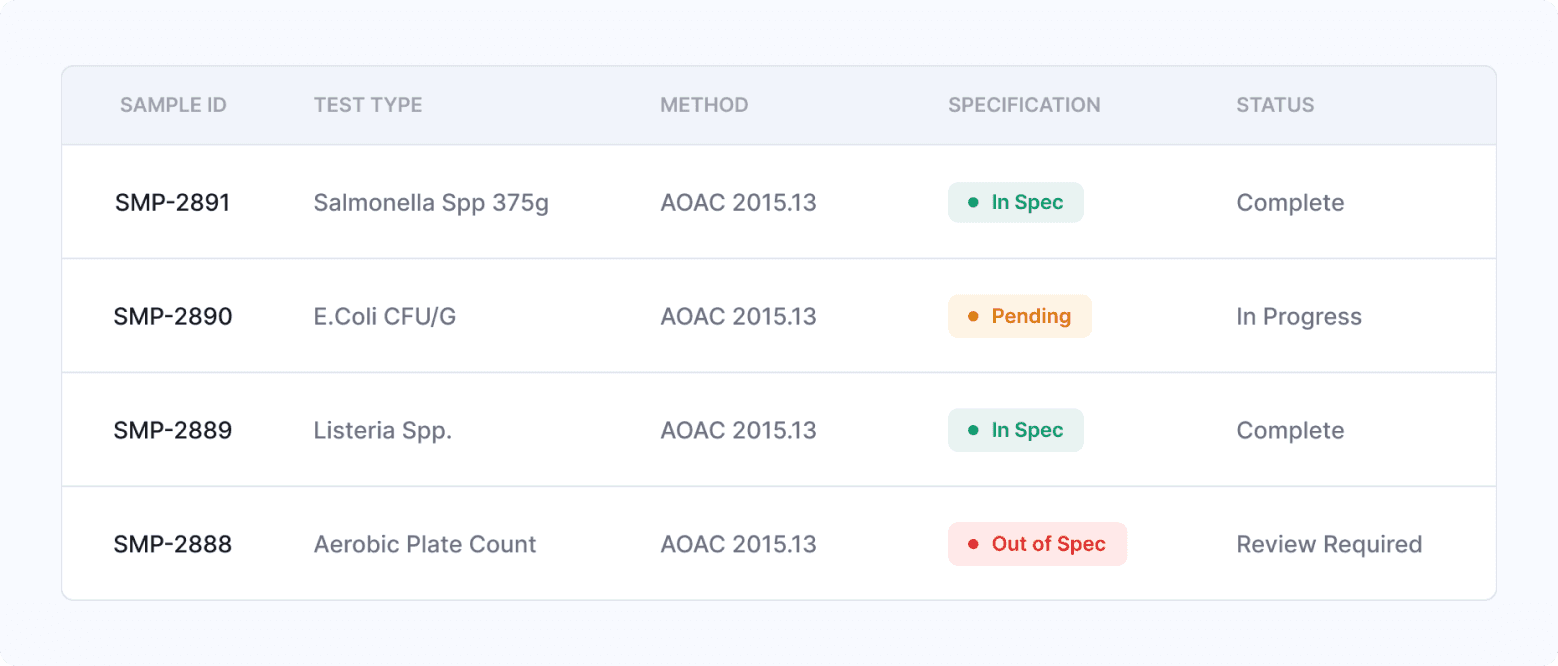
First column is the primary identifier, emphasised with darker, bolder text. Secondary columns use muted colour. 48px spaced rows to balance density and readability.
Semantic badges with dot identifiers make results quickly scannable: green means safe, red means action required. No one has to read the word "Out of Spec" to know there's a problem.
Badge colours use the same semantic tokens as the rest of the system, background at 12% opacity, text at full value. This ensures badges remain readable against any surface.
-> More components
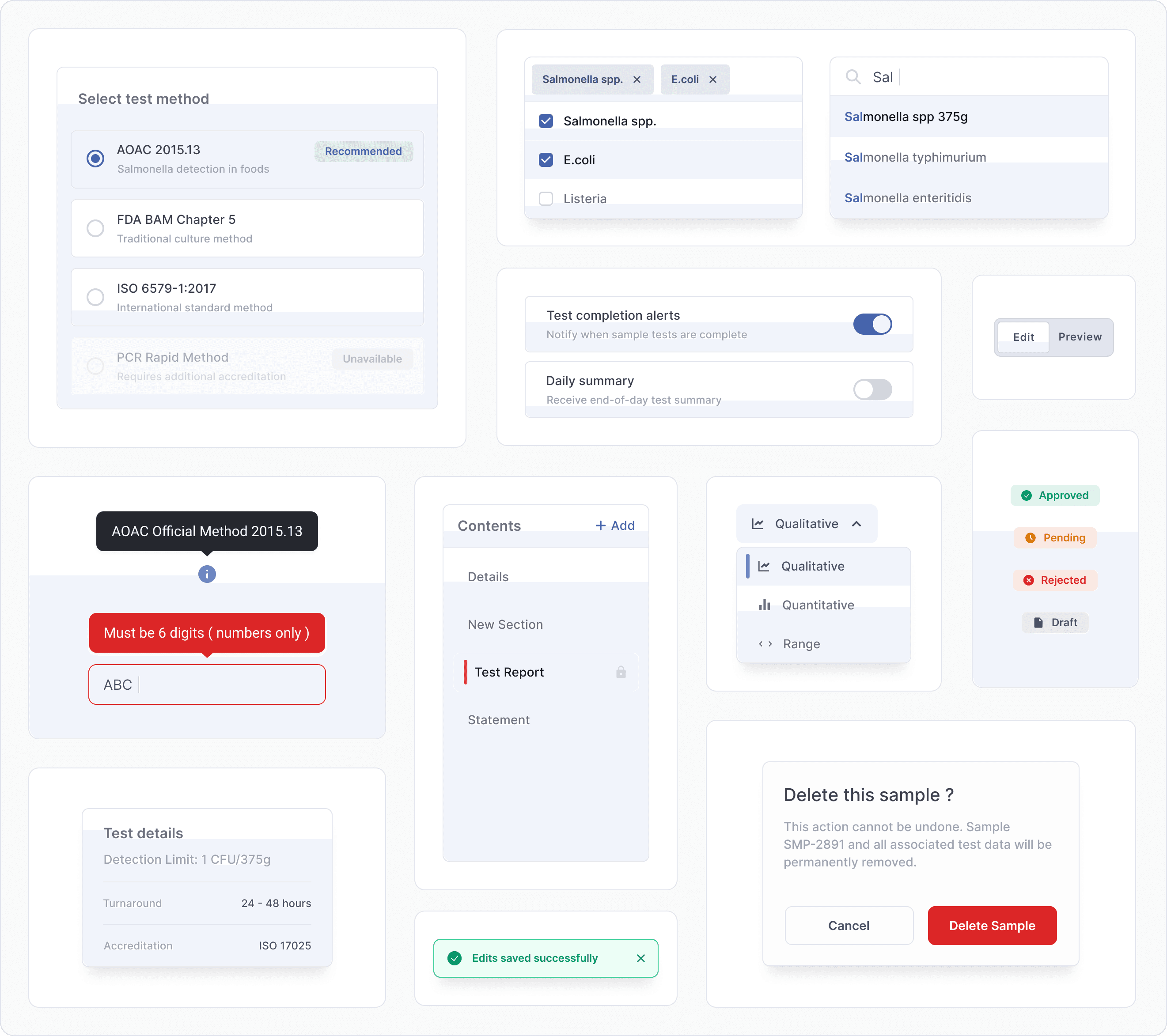
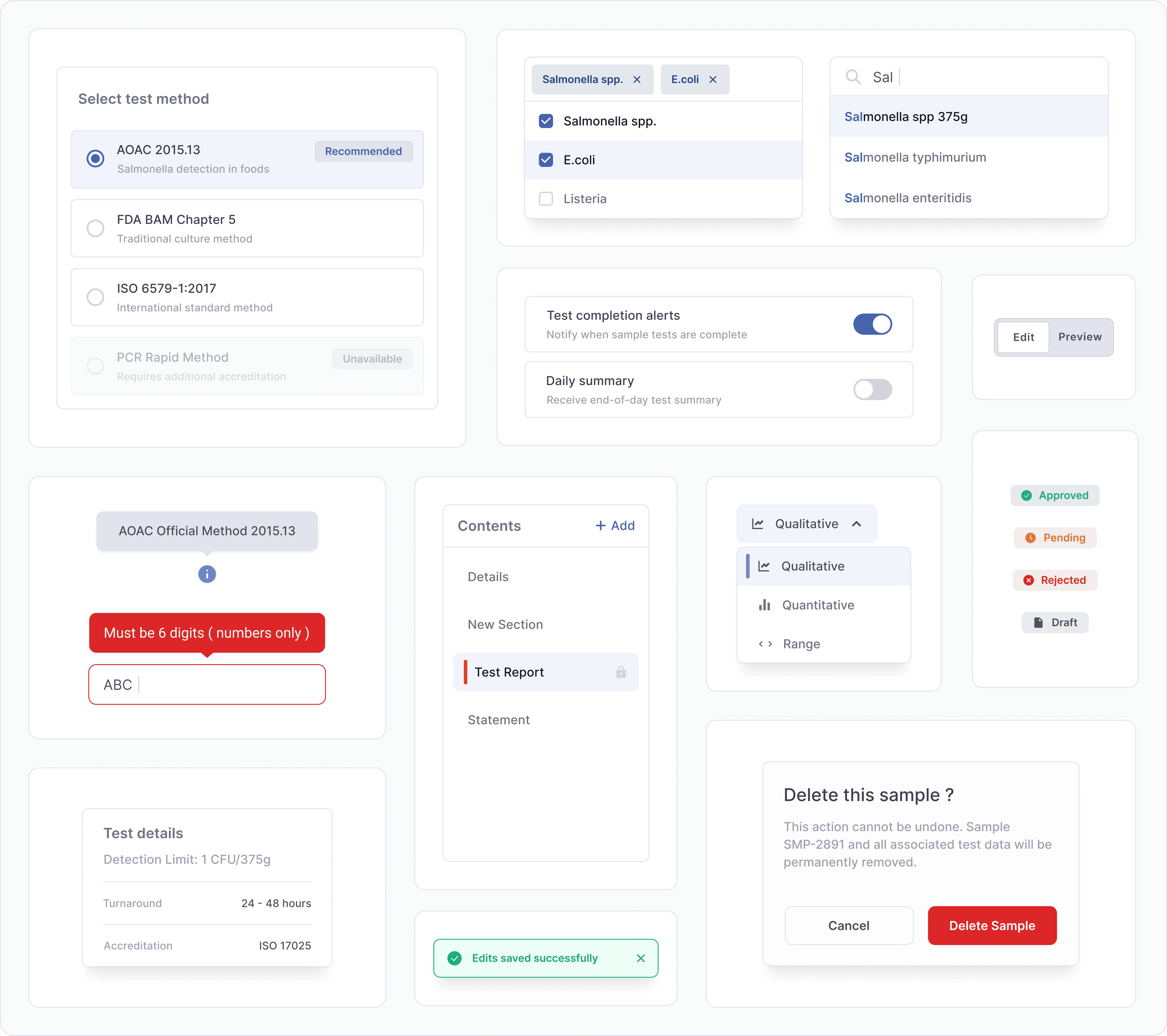
With the core established, we designed more components to support the system. Each element follows the same architecture and principles established in the foundations.