< Back
EAT SAFE VERIFIED
/
SHIPPED 2022
Making compliance invisible → 70% faster Certificate of Analysis document creation
UX/UI
Systems Design
B2B SaaS
0 → 1
Designing a system where compliance errors become structurally impossible by transforming documents into controlled systems.

OVERVIEW
What is ESV? And what is a COA!?
Before the problem makes sense…a little context.
EatSafeVerified (ESV) is a B2B food safety platform used by suppliers, manufacturers, and QA teams to manage the entire workflow - from sample submission and lab test tracking to document generation and audit preparation. Clients range from small organic farms to large-scale food manufacturers.
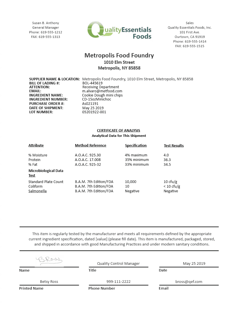
A Certificate of Analysis (COA) is the regulatory backbone of food safety. An official document showing test results, product details, and compliance statements - a product's safety passport. What auditors ask for during FDA inspections. A missing field or outdated regulatory language can invalidate an entire product batch, delay shipments worth hundreds of thousands, or trigger a recall.
Hiding in plain sight
When I joined ESV, the brief for my first project was simple: " Help QA teams create COAs faster. " But something was immediately strange - these critical documents were being assembled outside the platform. In Word. From templates on personal drives.
I needed to understand why. So I interviewed five QA managers across different company sizes and product types, and spent two weeks shadowing them. Despite their differences, their workflows were almost identical.
Here's what I saw
Here’s a typical walkthrough. A QA Manager at a mid-sized organic supplier has been building the same Certificate of Analysis for forty-three minutes. Exports test results from the lab system. Finds the right template buried somewhere in a personal drive. Copies values by hand. Cross-references FDA requirements. Double-checks everything...triple-checks the regulatory language. Generate PDF. Hope everything was right and nothing was missed.
This wasn't an outlier. This was the daily workflow for most QA teams across our user base.

This wasn’t just inefficient.
In a zero-tolerance compliance environment, every step introduced the possibility of an undetectable error.
And that made this more than a workflow problem - it was a liability.
Getting uncomfortable with the truth
I spent two weeks interviewing and shadowing QA specialists to understand not just what was slow, but why a workflow this fragile and cumbersome had become standard practice.
🗣️
5 QA MANAGERS
In-depth Interviews
👀
2 WEEKS SHADOWING
Contextual Inquiry
📊
USAGE ANALYTICS
Quantitative Data
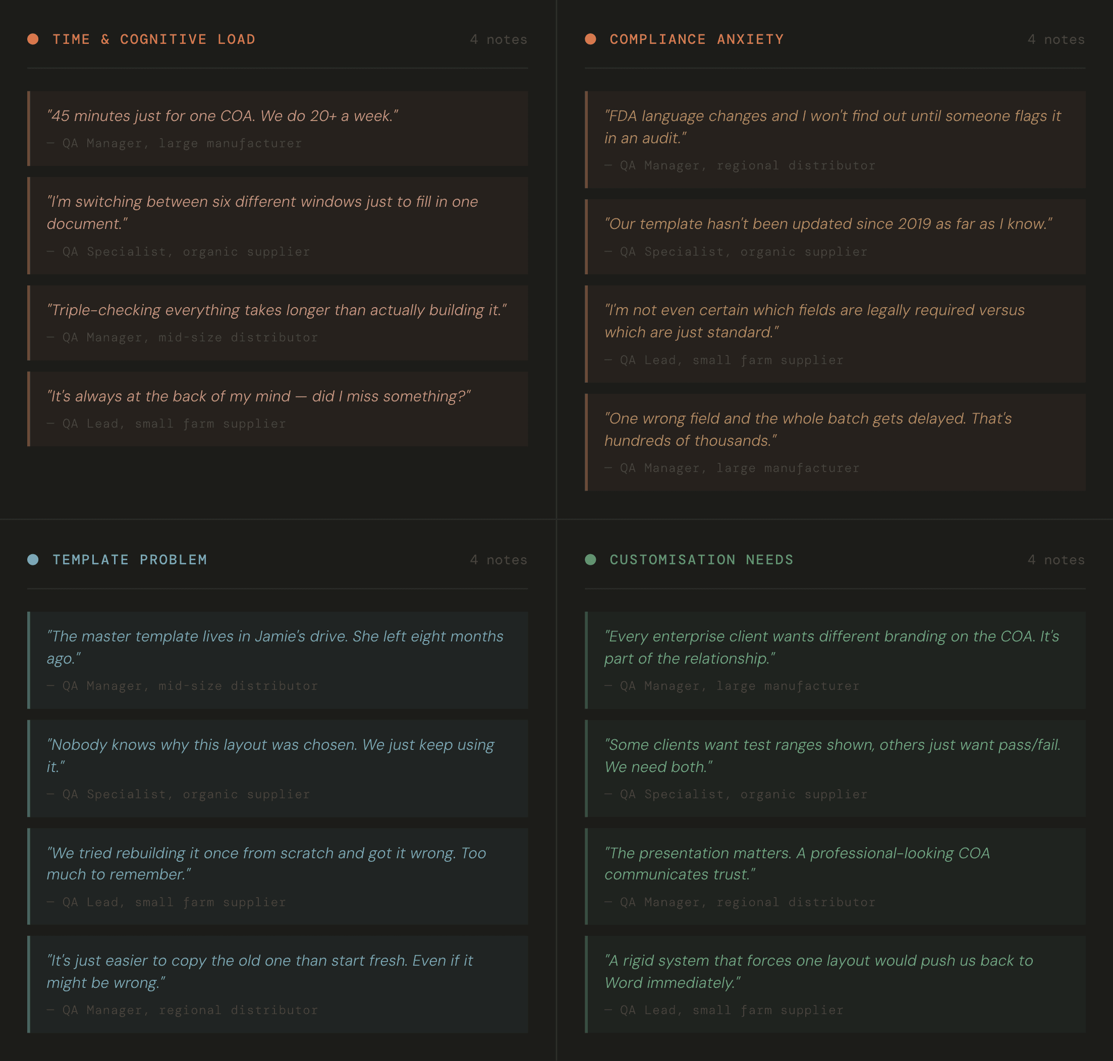
"I know what a correct COA looks like... I just don't have the time to rebuild it every time."
- QA Manager, during research
‘ The Templates were artifacts ’
Teams resisted moving away from Word templates. Not because they preferred Word…but because those templates contained years of invisible expertise.
Regulatory language that had been refined over audits. Field placements that avoided past errors. Layouts that clients and auditors trusted.
They were records of what had worked…and what had failed - over time.
Rebuilding them felt risky. because no one fully knew what could be safely changed.
In a regulated workflow, that uncertainty is enough to stop adoption.
What the numbers revealed
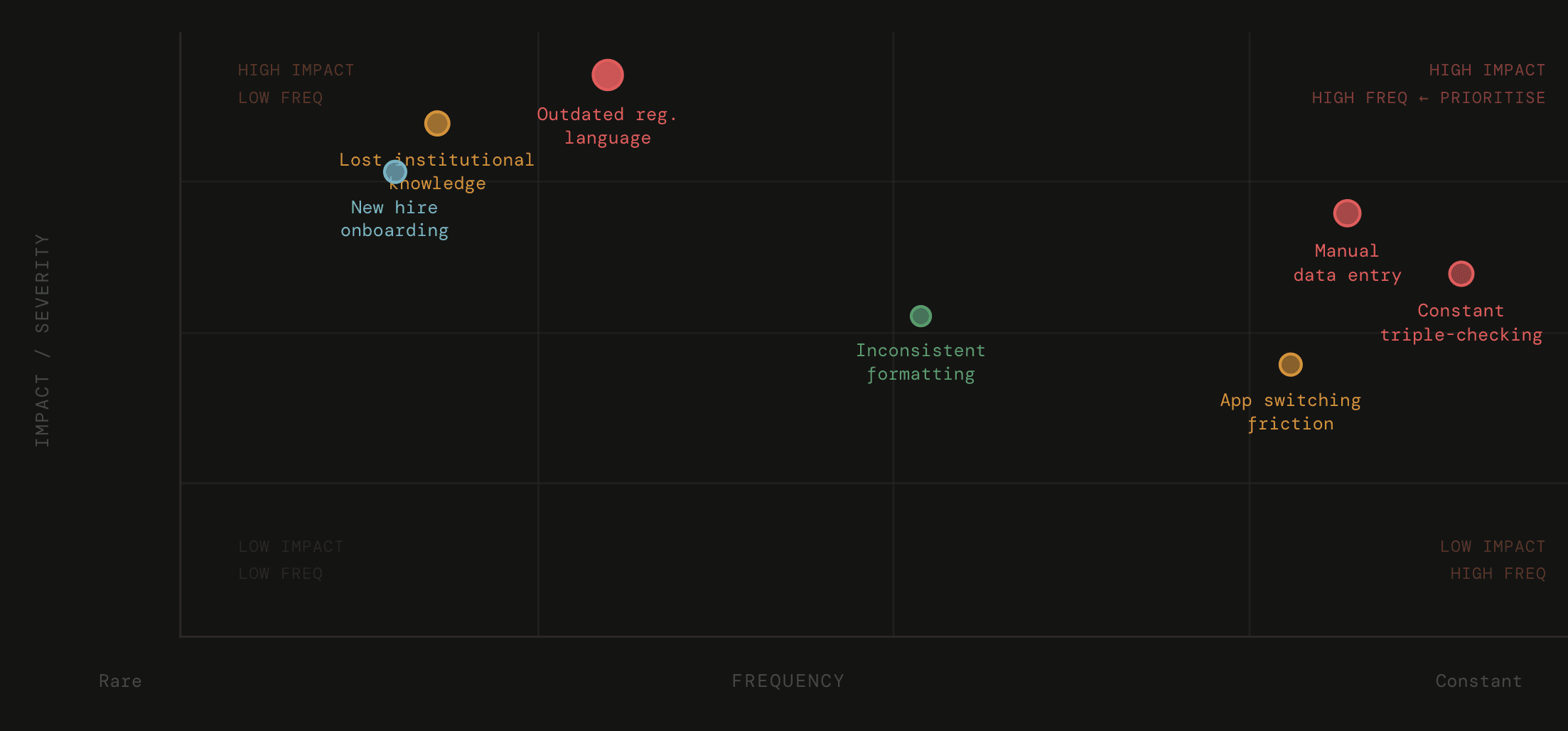
Digging into usage data with the team revealed patterns that matched what I was seeing:
6-8
60%
The compliance errors weren’t caused by carelessness…They came from users correctly following incorrect structures.
The platform had delegated its most critical responsibility, compliance, to users.
As long as correctness depended on memory and manual checks, speed wasn’t the real problem.
The problem was that an incorrect COA could be created at all.
FRAMING
The Flexibility vs Safety standoff
There was a tension that kept surfacing during research that couldn't be resolved by picking a side. QA teams genuinely needed flexibility - customisation wasn't just aesthetic, it was part of client trust and professional credibility.
But any flexibility that allowed required fields or regulatory language to be altered introduced unacceptable risk.
Too much freedom
Missing mandatory fields
Outdated regulatory language
Transcription errors
Audit failures
Too much restriction
Rigid, one-size-fits-all output
Workarounds outside the system
Unhappy clients
Eventually back to personal templates
This made me question…
What if we stopped asking " how do we help users avoid mistakes "
and started asking " how do we make mistakes structurally impossible "?
The system owns compliance. Users own customisation. Those two things don't have to conflict.
This could remove the possibility of incorrectness altogether.
The solution emerged from a shift in perspective.
A COA is not a document, it's a structured output assembled from four independent data sources - each with its own validation requirements and system of record.
Even a perfectly transcribed COA carries structural risk: it cannot be re-validated, it cannot detect when source data changes, and it leaves no audit trail. For an FDA inspector, the question isn't just "is this value correct?"… it's "can you demonstrate how this value got here?"
This reframe was the foundation for every design decision that followed. If a COA is an assembly, then the builder isn't a document designer - it’s for setting up the structure behind them.
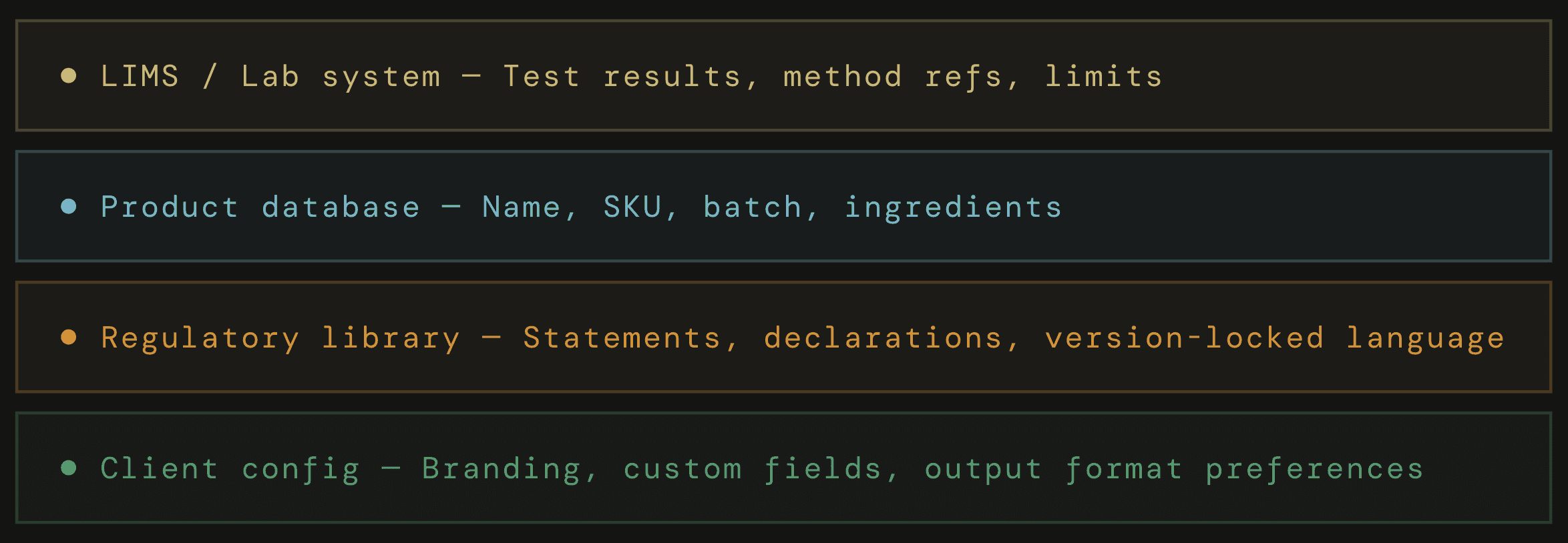
-> The information architecture — decomposing a COA into tiers
I worked with engineering to decompose COAs into modular sections - each with an explicit permission tier that governs what can be changed, what must be system-controlled, and what the user owns entirely.
🔒
LOCKED
Test results
Regulatory statements
Product name
System-controlled. Can reposition, can't edit content.
🔐
PARTIALLY LOCKED
Product metadata
Signature block
Contact details
Some fields locked, others editable. Layout flexible.
✏️
FREE
Company branding
Custom sections
Text boxes
Full control. Add, edit, delete, style as needed.
Information architecture - Three-tier permission model
-> Data mapping - from system to coa
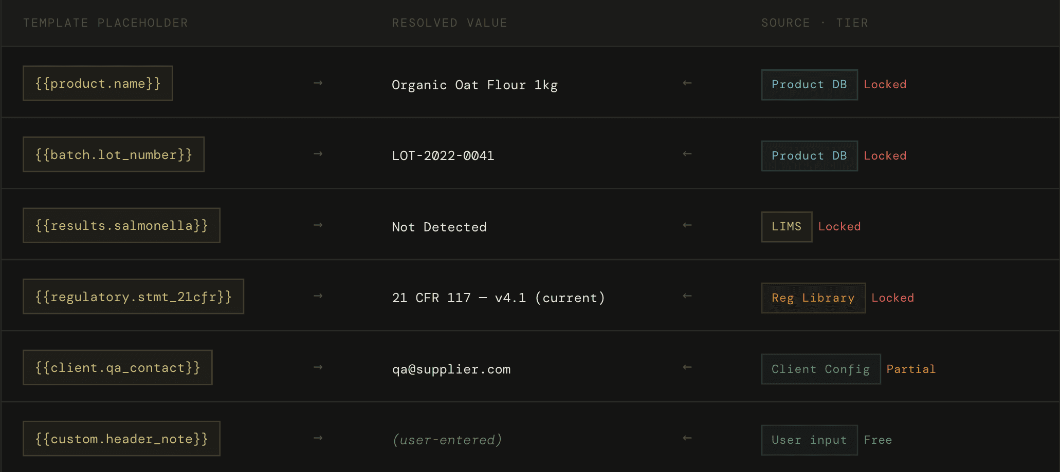
Every field in a locked or partially-locked section is a named placeholder - not a hardcoded value.
When a user selects a product, the system fills in those placeholders automatically all at once. It pulls data from the right sources, checks that each value is valid, and only then generates the COA.
-> The interaction principle — if the system let you do it, it was safe
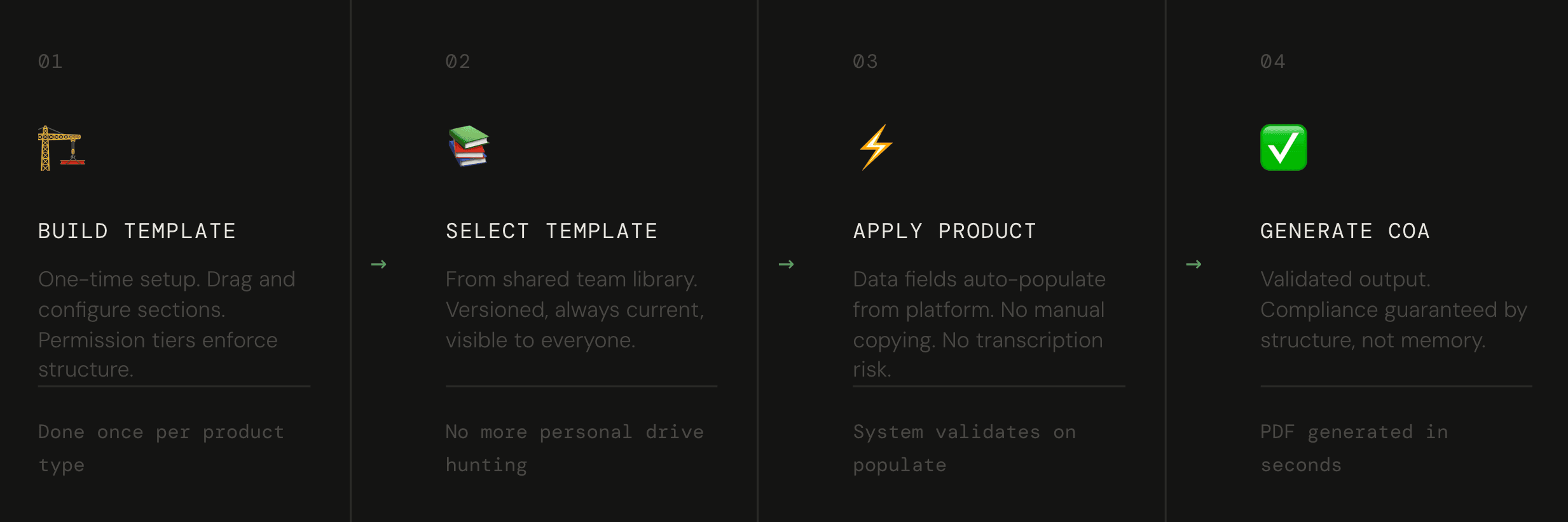
This became the guiding rule for every interaction decision in the builder. We didn't want users to need to think about what was allowed. The permission model had to be self-evident through action - not explained through documentation, not communicated through warnings.
A user dragging a field onto the canvas would see it resolve, or snap back, based on the tier of the section they'd dropped it into. There was no modal, no error message, no explanation needed. The behaviour was the explanation.
And finally...The COA Builder
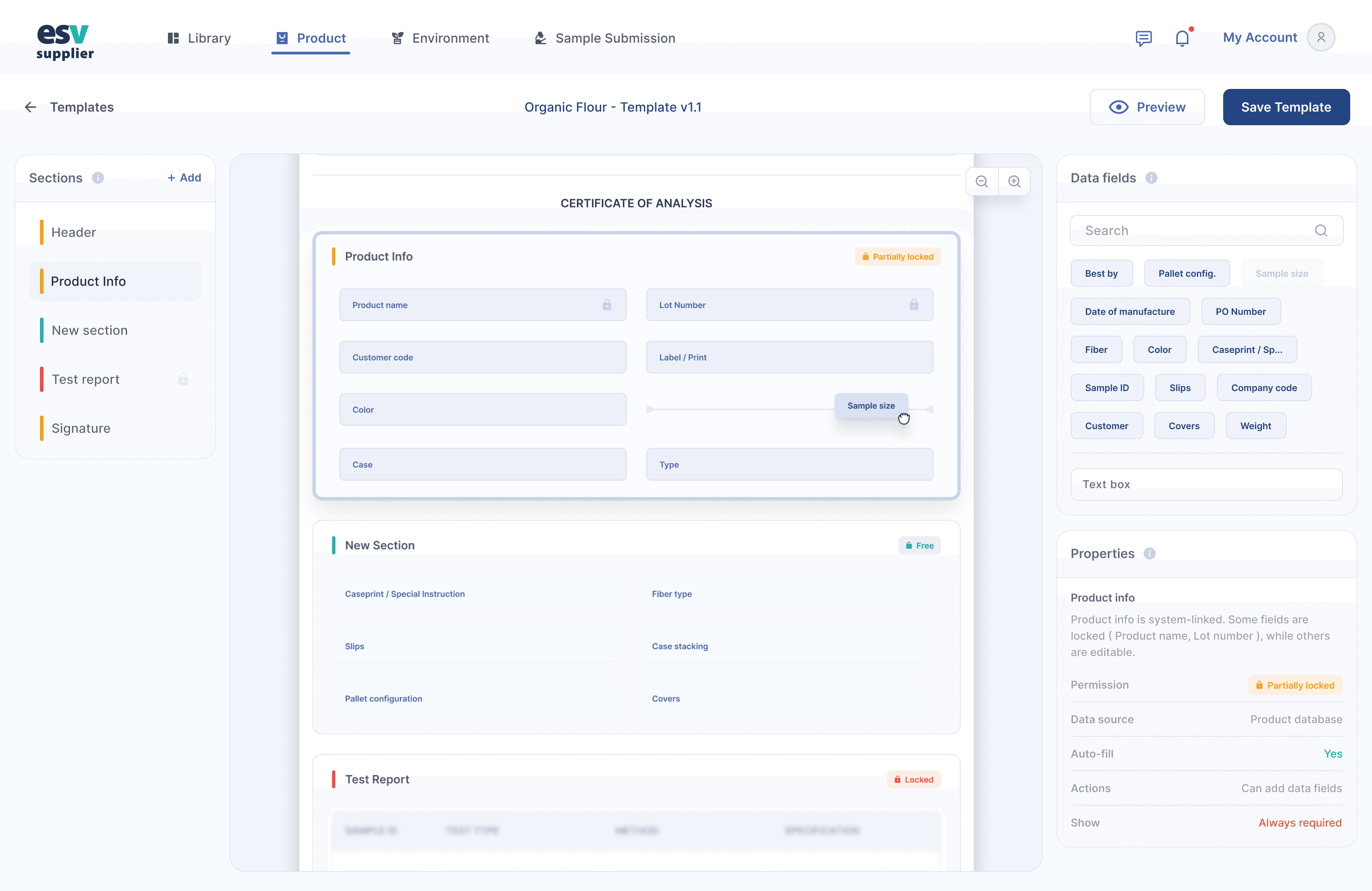
The builder is a three-panel interface: a section palette on the left, a live canvas in the centre, and on the right, data fields and a properties inspector. Each panel has a distinct job, and the design had to make the system's rules legible without explaining them.
Left panel
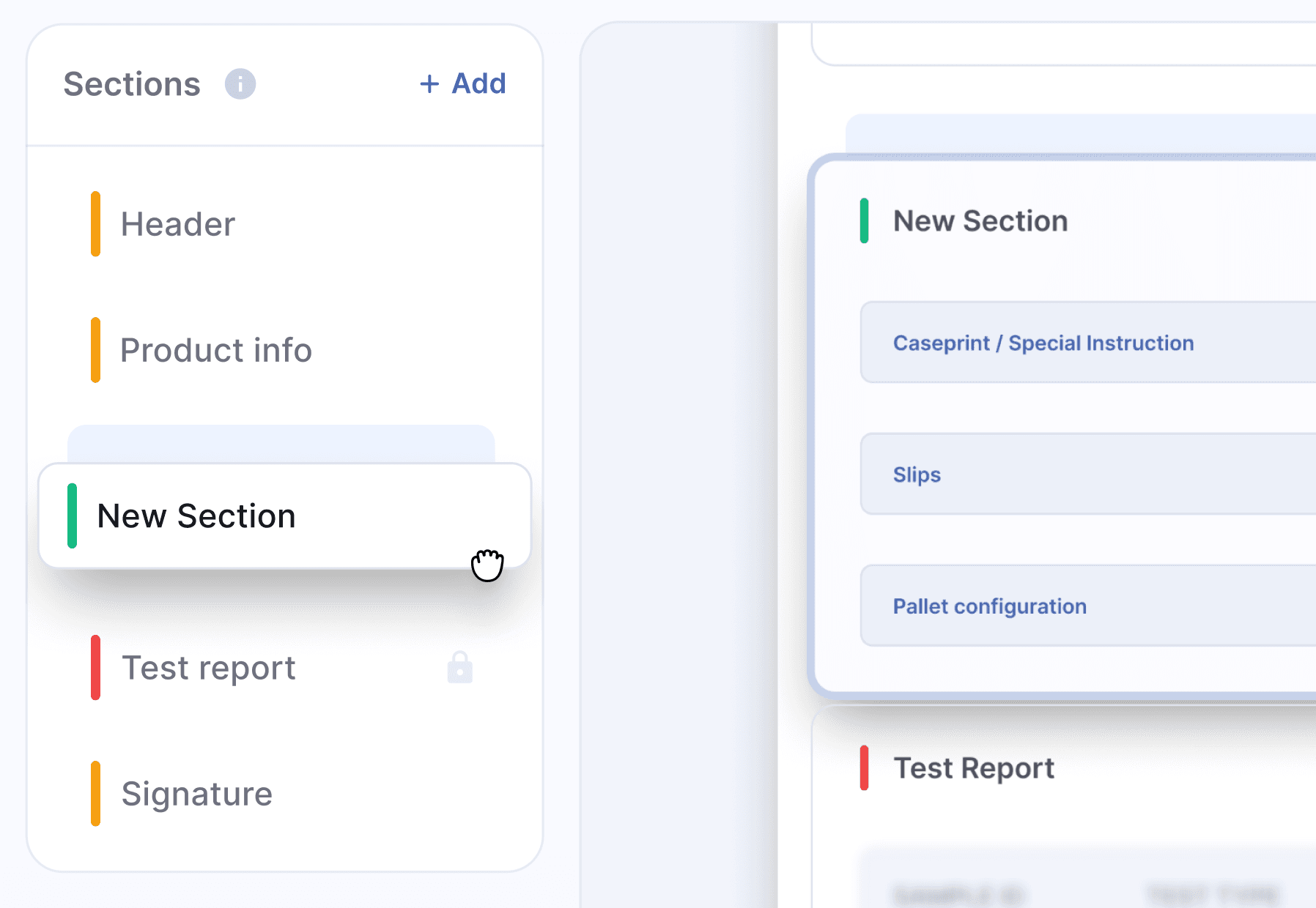
Sections
Lists every section available to the template. Each shows its permission tier badge.
centre panel
Canvas
A live preview of the COA document being assembled. Sections stack vertically. Free sections accept dragged data fields.
Right panel
Fields and properties
Selects when a section is clicked on the canvas. Shows tier, source binding, data origin, and user capabilities.
Tier indicators - On-hover tooltips
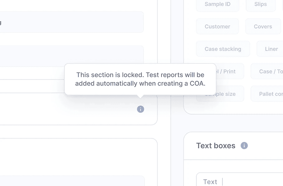
colour-coded left borders on each section communicated tier at a glance, with tooltips on hover explaining what each tier meant.
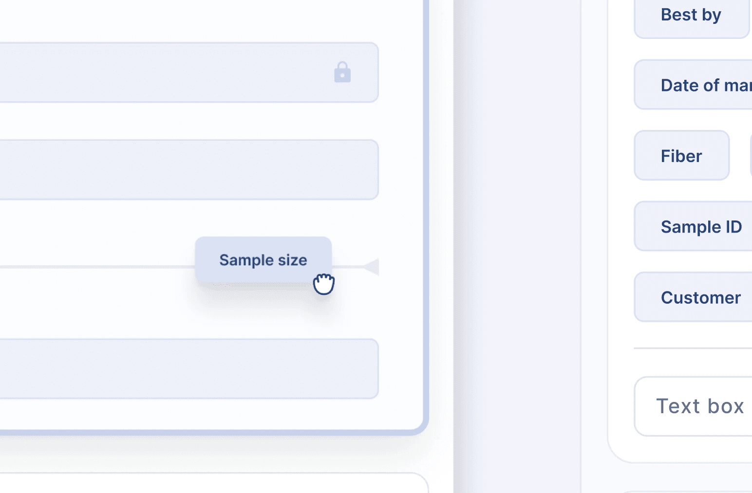
Drag-and-droppable data fields
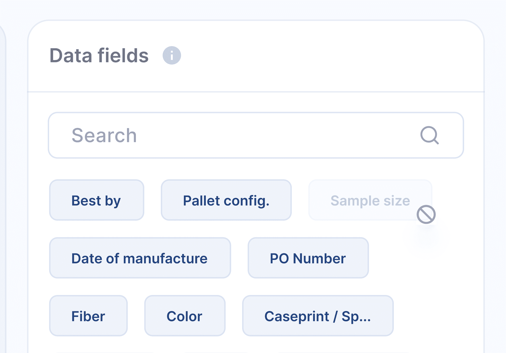
Users can drag data fields from the right panel directly onto sections. These fields auto-populate when a product is applied.
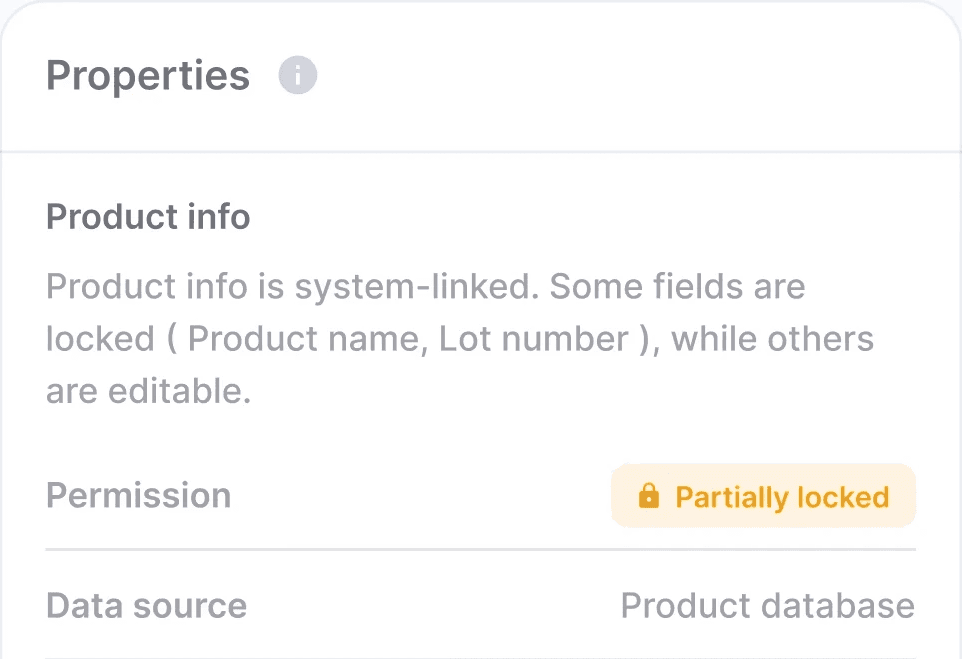
Properties panel
Clicking any section on the canvas reveals its full schema in the right panel: permission tier, source binding, data origin system, what the user can and can't do.
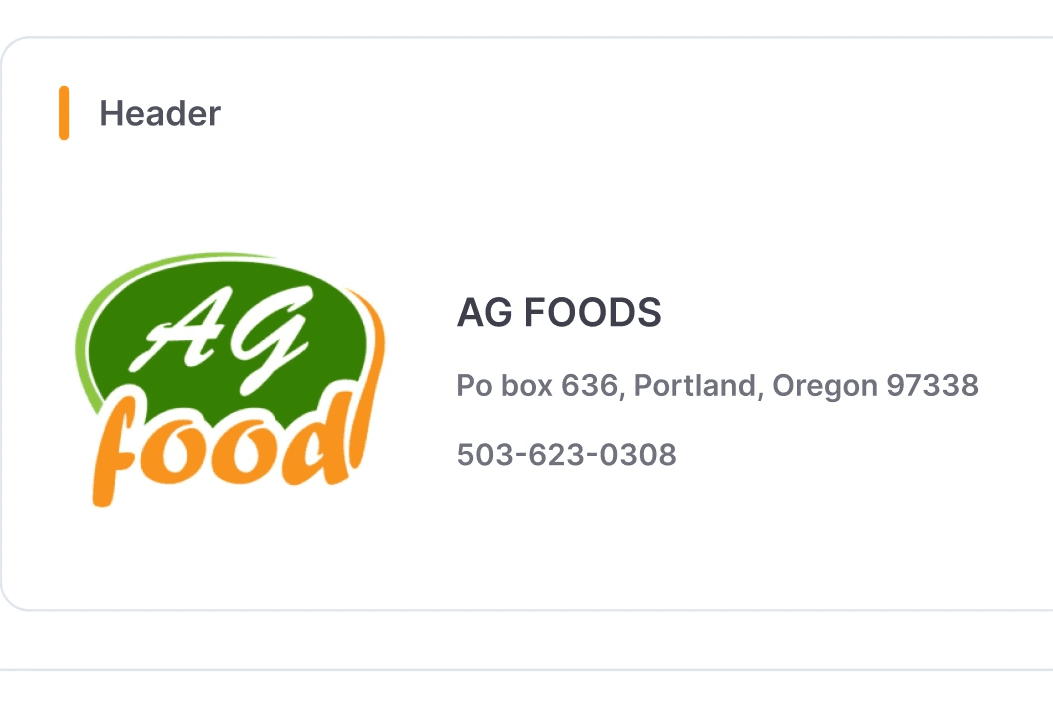
Freedom to customize
Headers, logos, and visual elements remain fully editable. These sections allow teams to match client requirements and brand guidelines without affecting compliance.
This wasn’t the final answer...
Naturally, the first design had problems.
Early usability testing revealed a problem: users couldn't tell what was editable vs. locked until they tried to interact with it.
This created constant uncertainty.
"I'm not sure if this is a bug or if I'm not supposed to do this."
- Participant during Round 1 testing
So changes were made…
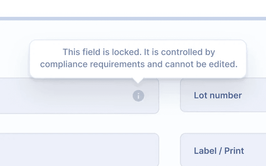
What didn't work
Tooltips on hover
Nobody hovered long enough to read them. Uncertainty persisted across sessions.
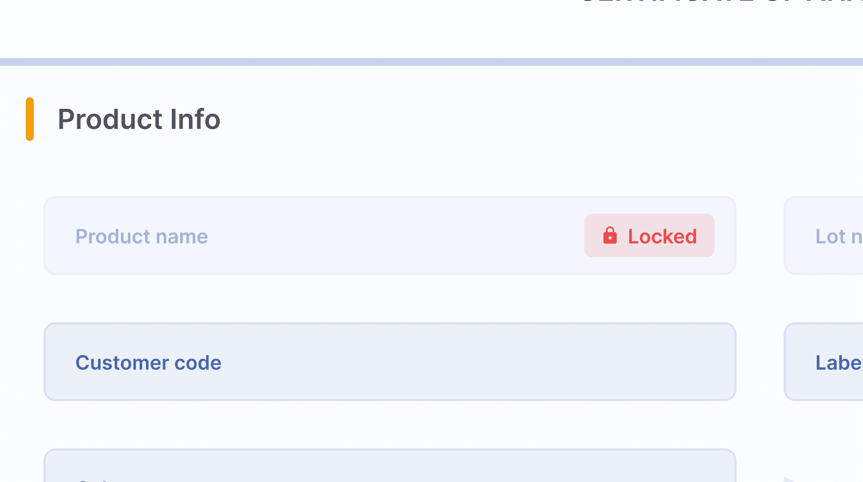
What worked
Persistent visual hierarchy
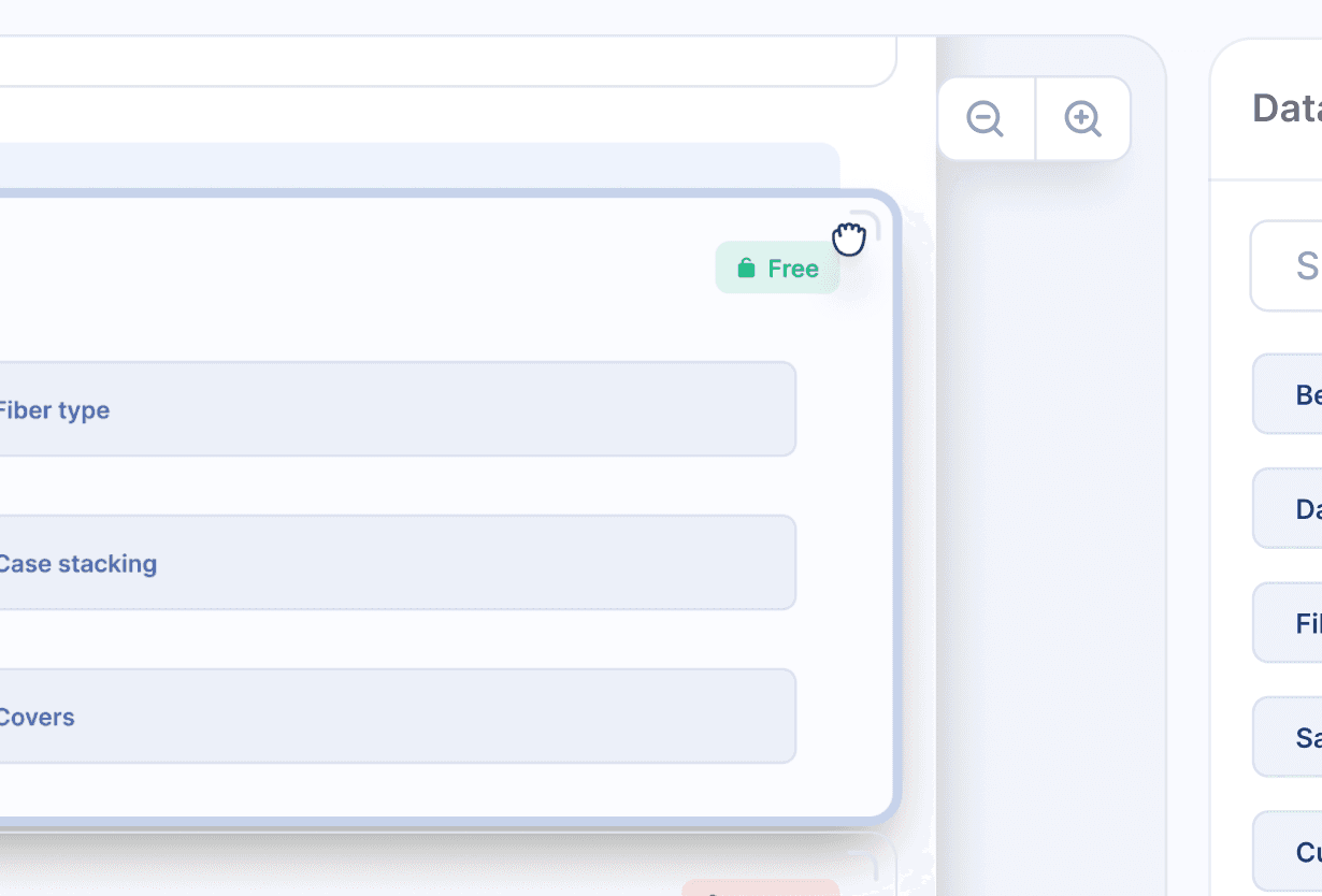
Permission state readable at a glance, before interaction. Locked fields are greyed out.
Silent prevention
The cursor change was perhaps the subtlest detail — and the most important. When a user hovered over locked content, the cursor became a lock icon. Over moveable content, a grabber. No label. No tooltip.
The moment we knew it worked…
A QA specialist tried to delete a required section, saw it snap back, and immediately said
" Oh, right...can't remove that."
No frustration. No confusion. The interaction taught her the rule clearly.
How these were measured
🧠 The behavioural shifts were!
Teams stopped double checking
In the first weeks after launch, QA teams still manually reviewed every generated COA - old habits. By week four, that behaviour had almost completely disappeared. They'd internalised that even if they wanted to create an invalid COA, the system wouldn't let them.
Expertise shifted focus
QA managers stopped spending cognitive energy on compliance mechanics. Instead, they focused on what actually required human judgment: interpreting borderline test results, advising clients on edge cases, analysing patterns across products.
Onboarding transformed
Before : 2-3 weeks of shadowing before new hires could create COAs independently.
After : New team members productive on day one. The system encoded the institutional knowledge.
Before
~45 min per COA, 6 app switches
Templates on personal drives
Correctness depends on memory
2–3 weeks to onboard new hires
After
~13 min per COA, 1 platform
Shared, versioned template library
Correctness guaranteed by structure
New hires productive on day one